Thursday, 8 November 2018

PRE-PRODUCTION UNIT: Test Shoot 2

Today we performed the second test shoot for VET-MAN. Having tested all the potential camera choices in the first test shoot in October, I knew which camera I would be using for this test shoot (and for the final film) - the Panasonic DVX200. Therefore, in this test shoot I solely focused on testing the different settings again (using the extra knowledge from my research into the camera) and seeing how the camera would work in a complex scene from the script. This allowed me to see how the camera performs when filming this scene and also allowed me to work with the director on blocking the scene to decide which camera angles would be best to capture it - this also gave me the opportunity to see how well I worked with the director and if there was any feedback I could give to make the collaboration run smoother during actual filming.

As the original plan with this scene was to mask the footage in the edit so that the real and fake owl could be interchanged when it came to the 'owl punch', I set the camera up on the tripod as this would make it easier to map the footage. But as the idea with this project is to go entirely handheld, I planned to add a manual handheld shake to the footage in post production - this would give the illusion that the footage was shot handheld and would keep up the continuity of the piece. I also shot some footage handheld to allow enough coverage to experiment with in the edit. As it turned out, we will not map the footage in the edit, we plan to use clever cuts as this proved effective in the edit after this test shoot, meaning that I will be able to shoot this scene entirely handheld after all - I will discuss this later.

To start out the test shoot, I white balanced and black balanced the camera to ensure that the camera was well adjusted to the shaded filming environment - this meant that the white and black seen by the camera would be the same as the human eye. As found through my research, unless the camera is set to auto white balance (which is far from ideal), it cannot automatically decide how white and black look in the different light. Therefore, it was important for me to set this first to ensure the colours were accurate for the environment and the natural light in this setting.


Even though the purpose of the first test shoot was to experiment with the settings on the camera to discover how to get the best exposure, I still wanted to test a few different settings to ensure I got the best image possible. Also, as I was testing multiple cameras on the first test shoot, I was conscious that I may not have spent enough time discovering the settings of the Panasonic. I have also conducted more research into the Panasonic so I wanted to put this knowledge to the test as well.

As I couldn't find the settings for ISO last time, this was something I looked into during my research. Through my research, I found that to change the ISO manually, you must go through the settings and change the ISO for the different 'gain' settings. As I was shooting on low gain, I made the ISO for this 500 as this proved good in the last test shoot - the exposure was good with little noise in the footage.

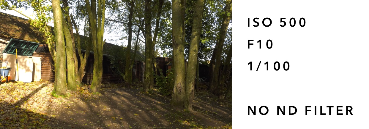
Also during my research, I found that using an aperture deeper than F8.0 (e.g the aperture I used F10.0) will make the image appear softer through diffraction - I wanted to test this in the test shoot to see whether I could notice this difference so that I know what look to avoid during the actual shoot.

The image did appear slightly softer but not to a noticeable extent. However, I will avoid setting the aperture deeper than F8.0 to reduce the risk of a soft image as I am able to get a good exposure by changing the other settings on the camera which do not affect the softness of the image. I set the shutter speed to 1/100 which is faster than the shutter speeds used during the last test shoot. As it was a brighter day, using a faster shutter speed didn't actually make the footage too dark (which is what I was expecting following the last test shoot where I stuck between 1/50 and 1/60). In fact, without an ND filter, the footage was too bright - the sky and the beige door appeared over exposed.

Due to the first image being overexposed, I decided to see how similar settings would look with an ND filter applied as well. I decided to widen the aperture to F6.4 to ensure the image didn't look too soft - this would also allow more light into the lens as, without widening the aperture but applying an ND filter, the image may look too artificially dull. I decided to keep the shutter speed set at 1/100 as this appeared to be good for capturing motion and applied the ND filter 1/4. This gave the ideal look - the sky remained bright but with a tint of blue, the door remained its natural beige colour, and the rest of the image is not underexposed. 


After seeing how an ND filter affected the exposure of the image, I decided to see whether this look could be replicated just by adjusting the camera settings. The wider aperture of F7.2 and faster shutter speed of 1/100 and no ND filter resulted in a darker image where the beige door appeared how it did in real life, however, the sky between the trees still appeared overexposed - it appeared white instead of the blue seen in reality. This shows that using an ND filter can be necessary when aiming for as realistic image as possible - it can be difficult to ensure the sky is not overexposed without affecting the quality of the image (because to reduce the exposure I would need to go for a deeper aperture or faster shutter speed but adjusting either too much may decrease the quality or how realistic the image looks - a deeper aperture may cause a softer image by diffraction and using a shutter speed that is too fast may eliminate any motion blur which would give the footage an unrealistic smooth quality).


Although the second set of settings produced the ideal result, I still wanted to see if using a darker ND filter would improve the look of the image. As well as applying the ND filter 1/16, I set the aperture at F6.8 and chose a slower shutter speed of 1/48. Decreasing the shutter speed allows more time for light to enter the lens, meaning a brighter exposure. I thought it was necessary to decrease the shutter speed as the ND filter is quite heavy and produces a very dimly exposed image so allowing more light into the lens will allow a brighter exposure. For the same reason I also widened the aperture to increase the amount of light coming into the lens. This gave a realistic look with the sky appearing bluer than the other images but some of the shadowed areas appeared too dark and underexposed. 


Overall, the settings for the second piece of footage gave the ideal result - using ISO 500, aperture f6.4, shutter speed 1/100 and an ND filter 1/4. This gave a really realistic result where the sky doesn't appear overexposed and the shadows are not underexposed. These settings also allow for the natural shadows from the sun to show up - with the first settings, these shadows appeared too harsh, whereas in the other pieces of footage, the shadows appeared too soft - giving a less natural look. 


As well as testing the settings on wide angle shots, I decided to test the settings with the lens zoomed in on a close up shot to see what settings gave the best exposure and the best depth of field for the most natural cinematic look.

The first set of settings I tried were ISO 500, aperture 6.4, shutter speed 1/100 and no ND filter. This gave a well exposed image, however, it was a little bright in areas (e.g. at the top of the tree and the metal of the cage behind the tree). As the aperture was quite wide, there was a fair depth of field, however, for a close up shot I would ideally have liked the depth of field to be greater to make the subject stand out more within the frame. As with a lot of the footage of the wide angle shot, I used a faster shutter speed than I used in the last test shoots as I found this gave a good result with the exposure. From this, I have decided that I would like to shoot with a shutter speed between 1/50 and 1/100 - I will test this in the next test shoot.


For the next set of settings, I tested ISO 500, aperture F5.3, shutter speed 1/50 and ND filter 1/4. This produced an ideally exposed image where the depth of field is deep but not indistinguishable. The wider aperture of F5.3 produced this deeper depth of field, and this combined with the slower shutter speed allowed for a bright enough exposure with the 1/4 ND filter applied. The application of the ND filter meant that none of image became overexposed whilst allowing for a greater depth of field created by the wider aperture. 


I also decided to test using the ND filter 1/4 with the settings ISO 500, aperture F6.2 and the shutter speed 1/180. Using a faster shutter speed resulted in a darker image - I also deepened the aperture to F6.2 which also darkened the exposure - however, I wanted to do this to combat how dark the faster shutter speed had made the background. I thought that deepening the aperture would make the background more distinguishable but as the exposure is too dark, the background is too underexposed to show detail.


Finally I tested the settings ISO 500, aperture F5.3, shutter speed 1/48 and ND filter 1/16. I wanted to see how using the ND filter 1/16 would work on a closer up shot, however, it meant that the background was too underexposed so all detail here is lost. The better naturally lit side of the background (the left hand side of frame) shows more detail than he right side of the frame which is plunged into darkness with a great lack of detail. To combat the darkness I chose a very wide aperture and a slow shutter speed to allow more light into the lens, however, this could not combat the darkness enough and ended up producing an underexposed image. I feel like these settings would have worked better under brighter or harsher light but as this was a shaded environment, the heavier ND filter was unnecessary. 
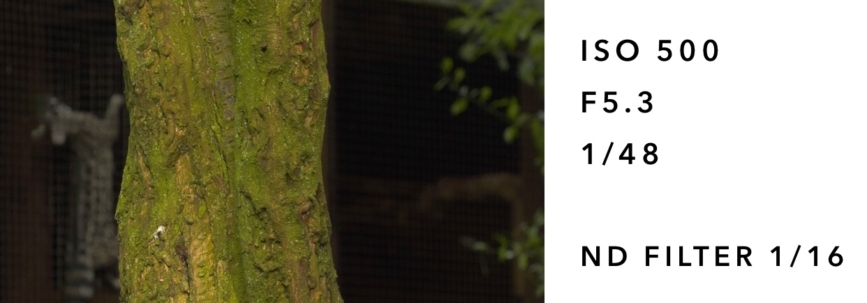

Overall, I found that the second set of settings worked best to produce a well exposed image with a good depth of field which made the subject stand out from the background whilst maintaining detail in the elements of the background. The wide exposure and slow shutter speed allow a lot of light into the lens and also allow for a good depth of field and accurate motion blur. Combined with the 1/4 ND filter, this produces a well exposed image where the highlights are not overexposed and the shadows are not underexposed - meaning the quality and detail in the image is as good as possible. 


Testing the 'Owl Punch'

As previously mentioned, one of the reasons behind this test shoot was to test this complex scene in the script. Having read through the script, I didn't know how I would effectively capture the scene where Tim ends up punching the owl without the actor actually punching the owl. After discussion with the producer and director, we decided to buy a fake owl which would be interchanged with the real owl during the edit - a role myself and Melissa are sharing. The original plan was to film the sequence on a tripod from 3 different angles (1 long shot showing the owl flying from the owl handler to Tim, 1 medium close up over the shoulder shot of the owl flying towards Tim, and 1 close up shot of Tim punching the owl). The reason behind using the tripod was so that the camera would stay in the exact same position so that 1 shot could be taken flying the real owl and then the exact same shot could be taken with the fake owl being thrown in - the same method was used from all 3 different camera angles (although in the close up shot using the real owl, the subject did not go to punch the owl). The plan was then to map and mask the footage in the edit so that the real owl could be swapped with the fake owl to make it appear that the owl was being punched. I also filmed a handheld shot from each different angle for coverage incase I wanted to put these into the edit. However, it proved unnecessary to map and mask the footage to replace the real owl with the fake owl as with a series of quick cuts, it is unnoticeable that the owl in the final close up shot is a fake owl. The fake owl is only seen for 10 frames so to an unsuspecting audience member, the owl looks realistic. This means I ended up using 2 pieces of handheld footage (1 long handheld shot and 1 handheld close up shot) at the beginning and end of the sequence. The medium close up over the shoulder shot on the tripod captured the movement of the owl best so I decided to use this in the edit but add a handheld effect onto the footage (which was the plan if all the tripod shots had been used if I had chosen to mask the footage instead).


Colour Grading

As well as editing together the sequence, I decided to perform some colour grading to experiment with the look I wanted to achieve. Throughout this project I have been planning on achieving a natural cinematic look - this will be achieved by using colours that are natural to the environment and not too different to the raw footage the camera picks up itself - however, I will then enhance these colours to make the pictures appear more vivid. Through my research into colour I also found that the colours orange and teal are often used in major films to give a more 'epic' look. Whilst I am not attempting to achieve an 'epic' look with VET-MAN, I thought I would take elements of this and apply it to VET-MAN so that it has a cinematic look but in a more subtle way so that the project retains its natural, observational feel.


Above is the original footage and below is the colour graded footage. The main difference is how vivid the colours appear. Where the leaves appear a dirty green colour in the ungraded footage, they have been given a much warmer orange colour in the graded footage. The skin tone of the subject is also noticeably different - whilst the skin in the ungraded footage does have a natural peach / pink tone to it, it is still slightly grey in tone, making the subject a little washed out. Therefore, in the graded footage, I decided to enhance this so that the pink appears more vivid and matured yet still in a natural way.

To achieve this look, I applied an orange / teal LUT at 40% intensity and then altered the shadows to have a light blue tint (+0.2), the highlights to have a light orange tint (+0.4) and the midtones to have a blue tint (+0.1) - combined this creates the natural cinematic look I was aiming for.


Overall I thought this test shoot was successful.

I explored the settings of the Panasonic DVX200 further and was able to alter them to produce the ideal image. I figured out how to change the ISO (which is something I was unable to do during the last test shoot), however, I decided that the original ISO (500) that I had used for the first test shoot actually worked to produced the best exposed image with the least noise. The exposure worked well as when it came to editing and colour grading the footage, my main focus was altering the colours instead of having to compensate for bad exposure. I also experimented with more shutter speeds than the first test shoot and have narrowed down the shutter speed I wish to use to be between 1/50 and 1/100 - I will decide this in the next test shoot. I may decide to use slightly varying shutter speeds depending on the motion within the shot - but again, this will be decided after the next test shoot. Like the shutter speed, I will decide the exact aperture in the next test shoot but following this test shoot I know that I will want to keep it between F5.3 and F7.2 - following my research into DOPs, I know that it is important to choose a consistent aperture as this affects the depth of field of the shots and a constantly varying depth of field may be off-putting for the audience.

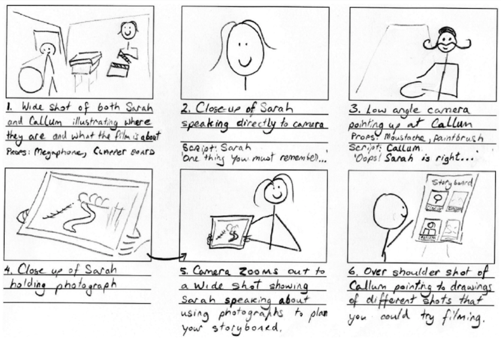
The owl punch was extremely successful - even though it was not achieved in the planned method, the alternative method used worked just as effectively to make this scene look realistic. Having tested this, I now have a clearer idea of how to storyboard and shoot this scene in the final project. Initially I would have thought that Tim punching an owl would be 1 or 2 shots but this 5 second screen took 3 different shots to achieve as shown by the example storyboard below.


I also thought the colour grading was successful, I managed to achieve the natural cinematic look I was aiming for. The colours and exposure remained similar to those captured by the camera, however, they appeared more enhanced and vivid.


Tuesday, 30 October 2018

PRE-PRODUCTION UNIT: Researching the Panasonic DVX200

Having performed a test shoot with multiple cameras, I have chosen the Panasonic DVX200 as the camera I will be using for VET-MAN. I therefore have decided to conduct some research into the camera to fully understand all the settings and functions.

All information has been found from the official Panasonic manual "A Guide To The Panasonic DVX200 Camera" by Barry Green.


On the Panasonic DVX200, there are 3 main ways to control the amount of light entering the camera:

- Lens aperture / Iris : The size of the aperture is measured in f-stops. The smaller the f-stop, the wider the aperture and therefore more light enters the lens. The larger the f-stop, the smaller the aperture and therefore less light enters the lens.

It is recommended with the Panasonic DVX200 that when shooting in UHD or 4K you should stay between f/2.8 and f/8.0 to avoid a soft image. If you go deeper than f/8.0 (e.g. f/11 or f/16) the image will be a lot softer due to diffraction.

- Shutter Speed : This controls the amount of time light is allowed to enter the sensor - the longer the shutter speed, the more light is allowed to enter the sensor. The shorter the shutter speed, the less light is allowed in the sensor.

It is important not to use a shutter speed slower than the frame rate as this will result in frames being dropped.

- Neutral Density Filters (ND) : They darken the incoming light without affecting the quality of the image. The DVX200 has three in built ND filters which allows different levels or light cutting.

The settings are as follows:

Off: No ND filters

1/4: Reduces the amount of light coming into the camera by two stops.

1/16: Reduces the amount of light coming into the camera by four stops.

1/64: Reduces the amount of light coming into the camera by six stop.

How to manually judge the correct exposure

As the LCD isn't always the most reliable in displaying the exposure of the footage, I decided to look into the other tools the camera has to offer.

Professional monitoring tools use the IRE scale which measures video brightness from 0 (pure black) to 109 (clipped white).

Zebras : This is an overall on the video monitor that shows up any time an element in the image is brighter than the predetermined level (that you set before shooting). Generally, you do not want to see  105+ zebras anywhere on the screen and when shooting a caucasian face you do not want to see 70+ zebras on their face.

Y Get Marker : Goes hand in hand with zebras. Marker tells you what brightness is occurring at centre of screen.

Waveform Monitor : This tells you the brightness of the image in a 3D way as opposed to a 2D way (like zebras). Shows the relative brightness across screen and how many pixels in each column are at which brightness.

The Histogram : This is a graph that appears to help judge proper exposure.

An external monitor can also be used but as I will be shooting handheld for VET-MAN, I will use the inbuilt LCD screen for ease of use and mobility.

Autoexposure can also be used, however, this would give me less control over the way the image looks, therefore, I will be deciding the settings manually.

Another way to increase the brightness of the image is to adjust the gain (or ISO) of the picture. This works as an electronic amplification of the video signal to artificially make the picture brighter. However, as this is an artificial means of increasing the picture brightness, it means the more gain you apply, the more electronic noise there is in the picture. The best images come with as low ISO as possible. Increasing the gain also does not increase the detail seen in the picture - gain only amplifies the signal the camera is currently seeing, it cannot add detail that can't be seen due to underexposure.

Further to the exposure of the picture, there are more elements to consider for a good quality shot. White balance is important for the colour temperature of the footage. White balance needs to be set for each environment due to the changing colours present - the white balance determines how the camera sees white in each environment with different lighting. To set the white balance, a white card should be held some distance from the camera (preferably near the subject's face), the camera should then be zoomed and the white balance button pressed once the white card takes up the entirety of the frame. This sets how the camera sees white for this environment - it should be set for every environment. The DVX200 is also capable of doing a black balance - to perform this function, the white balance button should be held down. This shuts the iris and the camera analyses the signal to determine the black balance.

The focusing of the image is also important to ensure the best quality image. However, the LCD screen and viewfinder do not have enough pixels to show the imager sharply - this is why the camera has additional settings to aid this. The camera has the 'Expanded Focus Assist' and 'Peaking'. The Expanded Focus Assist magnifies the centre of the frame, allowing for more detail to be displayed. However, this is only useful when setting up the shot as it cannot be used during recording. Peaking can be used during recording, this option draws an outline around objects in sharp focus meaning that it will be clear during the actual recording which aspects are in and out of focus.

Another technique to ensure the best image quality is shooting in 4K. Shooting in 4K means that the footage can be displayed on larger displays without reducing the quality of the image. It also future proofs the footage by shooting in as high quality as possible - this means that even if VET-MAN isn't intended for 4K screens, it is capable of performing on these screens in future. Shooting 4K also ensures the sharpest and clearest HD images possible when shrinks down to HD size as the source image is larger. A further benefit of shooting 4K then down sizing to HD is the reduced noise - this therefore increases the image quality. This also allows for more scope during the colour grading process.

Understanding these settings will allow me to shoot VET-MAN in the best way possible. I will use this information during the further test shoots.

Sunday, 28 October 2018

PRE-PRODUCTION UNIT: Storyboarding - Research

Purpose of Storyboarding - The main purpose of the storyboard is to outline how the production will be achieved visually. This is usually accompanied by a shot list which details each shot, shot type, framing, camera movement and description of the shot.

Process of Storyboarding - Information from Professional Storyboarding: Rules of Thumb by Sergio Paez and Anson Jew

- The first thing to do is to read the entire script - re-read the entire script so that you know the sequence of events including the who, what where, when and why. Need to know how all the characters are feeling internally about what's happening and how they are outwardly acting upon those events.

- Break down the script. Prioritise what is important to show in a scene. Visually scan the script and list all people, places and props that will appear through the drawings. 

- Make notes on the script to decide which shot type will be appropriate for the events and movement involved.

- To accompany the storyboard, an overhead sketch of the architectural view can help to figure out the staging of a scene - and therefore help how the storyboard is drawn.

e.g.


- Pick out every word from the script. One block of description may need more than one shot to go alongside it - e.g. if a block of description is establishing the scene of the action, multiple establishing shots may need to be used to establish the locations, characters and events involved.

- Dialogue pieces may call for reaction shots as well as the action shot of the character speaking. Read the dialogue aloud and determine whether multiple shots are needed for coverage of this scene.

- The storyboard must ensure it fulfils the story point of the scene. Every scene and every image has a specific reason for being incorporated into the story - this reason must be clear to the audience. Anything that distracts from the story point should be cut.

- Identify the subtext in the dialogue and who is the focus or sympathetic character. This will help the staging to reflect the acting in the dialogue and therefore help the planning and storyboarding of the scene. Finding the subtext adds layers to the scene as a character may not say how they are feeling but can show visually (which can be depicted through the storyboards).

When it comes to actually drawing the storyboard - there are a few simple guidelines to follow. You do not need to be a storyboard artist to create a simple storyboard as a DOP but certain elements must be clear so that you can work effectively off the storyboard. The storyboard must also make enough sense to the director so that they can approve it before it goes into production.

Guidelines:

- Give figures solid poses with clear silhouettes
- Add simple tones - no more than 2-3 grey tones
- Only use colour when necessary
- Limit the use of arrows - add more panels to show movement to help action flow (but obviously use arrows if necessary to the shot).

When going through the script, there is a simple list of questions that can be used to aid making decisions about the storyboard:

About the scenes:
- How many are in the scene?
- What is the situation at the beginning of the scene and how is it different at the end?
- Who is affected by this change?
- How does this person feel about it?
- How does this scene affect the scene after it?
- How does it affect the one before it?
- How has this scene been affected by the one before it?

Within a scene:
- Who or what are we most interested in at this moment? What's the main focus?
- Who is in control of the situation?
- Where are we? Have the characters moved? If so, where?
- What's the subtext? What is being said or done and what does it really mean?
- What nonverbal cues might illustrate what's really going on?

Storyboards can be created in different ways, below are some examples of different types of storyboard:

1. Storyboards can be sketched with detailed outlines of scenes in order to display how the visuals of the production pan out. Although these sketches are simple, they are detailed in the amount of the scene they show (i.e. they show the objects and environments included within the scene) they are labelled and scaled so that they accurately show how the production will be realised.


2. Storyboards can also be simplified so that the main detail seen is the subjects / characters of the scene (i.e. the environment in which the scene takes place is not shown in detail). This is then compensated for by writing where the scene takes place in the description beneath the shot. This storyboard also features a separate box for the shot type in order to clearly display what is intended.


3. This storyboard is very simplified in terms of the drawings shown, however, what the drawings consist of is detailed below the shot. Furthermore, even though the shots are drawn very simply, they are drawn to scale (i.e. sarah appears small in the wide shot and then the closeup shot of sarah fills the frame). Although the viewer of the storyboard doesn't get as much detail into the visual of the scene, they are able to understand the direction the visuals will take.


4. Whilst this storyboard is also simple in the fact it uses stick figures, it uses arrows and labels to detail how the scene will pan out. This storyboard also uses panels of different sizes to show how the action within the scene changes - this is another option when storyboarding.


5. Another option when storyboarding is drawing incredibly detailed shots in order to clearly display how the visuals of the narrative will pan out. These drawings can also be continued outside of the box to display how the shots will continue and move - arrows are also used to show the direction of movements of both the characters and the cameras. Due to the increased visual detail, less detail is included in the descriptions.


6. Another option when storyboarding is an animated storyboard. This is another option which allows more detail to be displayed to give more of an idea how the visuals of the narrative will pan out. These animated scenes are accompanied by labels beneath them to detail the action.


I will use this research to inform the creation of my storyboard for the production of VET-MAN.


Friday, 19 October 2018

PRE-PRODUCTION UNIT: Director Of Photography - Research

In order to gain a better idea of what the role of a Director Of Photography is and what duties come with this role, I decided to conduct research into this job role.


Through my research I found that "The director of photography, also known as the DP or the cinematographer, assists the film director by establishing the visual look of the movie." [Searls, n.d.] This shows that the DOP collaborates with the production's director in order to establish the style of the production - the DOP is then in control of all aspects that make up this visual look and must check this with the director to ensure their vision is also being fulfilled.

The main purpose of a Director Of Photography is to "shape a film’s visual aesthetic" [Aldredge, 2016] - in order to do this, they must make all the decisions that contribute to this i.e. which equipment to use in order to create the desired result - they must also decide what this desired result is and why - to do this they must have a good insight into the genre of the production and also its intended effect on the audience.

The DOP must interpret the script written by the writers and identify the themes that run throughout the script. This will allow them to make the cinematic style and tone decisions as this will enable them to get a grasp on what the storyline is and, therefore, what the writer is trying to achieve through this.

Once the DOP has established the style and tone that they want to achieve through the production (through interpreting the script), they must work on the storyboard and shot list in order to create a complete visual representation of the script which will lay out how the filming of the production will take place. "The storyboard, combined with a thorough shot list, will lay out the film in its entirety so that the director and producers can schedule and plan the production."[Aldredge, 2016] This shows that whilst the storyboard and shot list must communicate the style and tone of the production, it is also used in a practical way for the scheduling of the production.


The DOP is in charge of deciding the camera and lighting equipment which is usually done through different tests to find the most appropriate kit for a production. It is important to note that "camera choice will then affect every other camera decision" [Maher, 2015], therefore it is important that the correct camera equipment is chosen for the shooting style as everything then depends on the camera being used (i.e. if the intended shooting style is handheld, the camera chosen must be able to perform this function so the DOP must test this before this camera is chosen). The DOP must know the camera's settings inside and out to ensure they know how to operate it for optimum performance. This means that on top of just being concerned with the visuals the camera gives, the DOP must also be concerned with the camera's technical capabilities. The DOP must know the dynamic range of the camera, the frame rate and the sensitivity (ISO) of the camera as this all contributes to the visual look of the production. On top of this, the DOP is in charge of deciding the framing and movement of the camera shots - this is usually detailed in the storyboard and shot list in order to communicate how the production will be visually achieved.


The DOP must have a good understanding of light and lighting temperatures in order to decide which equipment will deliver the desired result. They will then need to decide which lighting temperature would complement the tone of the production the best. As shown below, different temperature lights reflect different styles of light - therefore, the DOP must consider what style they are aiming for with the production in order to inform their decision into the lighting equipment and which settings to set this equipment to.


Further to this, the DOP is not only involved in the pre-production (planning the tone and aesthetic of the film and how this will be achieved) and production (filming the production) processes, they are also involved in the post-production process in order to ensure their visual aesthetic is continued through this process. This involves being in control of the colouring and colour grading of the production and this helps to set the tone and style.


References:

Aldredge, J (2016) 'What does a director of photography do?' At: https://www.premiumbeat.com/blog/what-does-a-director-of-photography-do/

Maher, M (2015) 'Cinematography Manual: The Ultimate Guide to Becoming a Director of Photography' At: https://www.premiumbeat.com/blog/cinematography-manual-the-ultimate-guide-to-becoming-a-director-of-photography/

Searls, D (n.d.) 'A Director of Photography's Duties & Responsibilities During Film Production' At: https://work.chron.com/director-photographys-duties-responsibilities-during-film-production-15918.html

Tuesday, 16 October 2018

PRE-PRODUCTION UNIT: Petra Korner - Director Of Photography - Research

I decided to do some research into female Director of Photography; Petra Korner, focusing on her film The Wackness. 

Petra Korner studied film at NYU's Tisch School of Arts and graduated with a BFA. Following this she trained at the Czech National Film Academy in Prague and the Maine Photographic Workshops. She also obtained an MFA in Cinematography from the American Film Institute in LA. She has won many awards for her cinematography. 

One of her films that I particularly admired the cinematography of was The Wackness which was shot on Balthar Lenses on Super 35mm film. 

Korner uses vintage colour grading throughout The Wackness. This can be seen through the muted colour palette used. The shadows of the image are a dark muted brown colour whilst the mid tones are a medium muted green colour and the highlights are a pale yellow colour - the same sort of tones are seen throughout the different scenes of the film. Combined with the bright exposure, this creates quite an idyllic, nostalgic look which seems very appropriate considering this is a coming of age comedy / drama and is therefore depicting an idyllic, youthful, care-fee time. This is an opening scene of the film showing the main character cycling through the park. Positioning him in the foreground and at the right side of the frame in a wide shot allows him to be the focus of the frame (clarifying to the audience that the film follows his story) but also works to establish the location as the remaining two thirds of the frame are left free to show the setting. 


As well as establishing the main locations through the opening scenes of the film, further panning establishing shots are used to show the changing locations throughout the narrative. The fact that all the establishing shots are panning shots struck me as interesting as it gives the impression that the city is rife with life and movement. This also shows that establishing shots don't need to solely establish locations, they can also be used to convey more than this (e.g. the vibe of the atmosphere etc.) Establishing shots such as these can also be used to break up the action in the film - it helps to transport the audience to different locations and different parts of the narrative which can act as a break from high intensity scenes.


Further interesting techniques are used throughout the film - this scene in particular caught my attention. The camera pans and tracks as the girl gets up off floor - this creates the same disorientating feeling for the audience as the woman is feeling herself. This shows that the camera techniques can also be used to convey the emotion of the character which allows the audience to gain insight into their state of mind and empathise with this. Camera movements which allow the audience to connect with a character prove effective in engaging the audience as they are able to put themselves in the characters shoes. This suggests to me that to ensure audience engagement with VET-MAN, I should be using the camera to do more than just capture the action within the scene, I should also be trying to get the audience to connect with the characters to that they can become more engaged with the scenes.

The colour grading of this scene is slightly different to the beginning scenes - whilst a muted colour palette is still used, this scene uses more rose gold toned colours. This continues the vintage feel of the film but there is an added warmth (as opposed to the cooler green tones of the opening scenes). This helps to show a change in environment - this is an interior scene, whereas the greener tones were present in the exterior scenes - showing that whilst colour grading can enhance a story by conveying the mood and emotions present, it can also be used to reflect the changing locations.


This film uses a lot of standard cinematic techniques to depict action and conversation (e.g. medium and close up shots are used in quick succession during action scenes to highlight the intensity of the situations and shot reverse shot is used during conversational scenes) hence why I have not spoken much about this style of shot within the film. These shots are used to move along the narrative in a way the audience can easily understand and follow.

The more notable shots in the film are the wide establishing shots used to change locations. This scene is established by a panning shot of a person walking by with a trolley. This camera movement helps to move the audience into the scene as they find themselves following the trolley and therefore feel more present within the action. The shot begins as a medium shot as the trolley enters the frame, it then becomes a close up shot as the trolley passes the camera and then becomes a wide shot as the person walks away - providing the wide frame that establishes the location. As this scene mainly occurs in an interior location, the warm rose toned colours are used - however, in the distance, the green muted colours make a reappearance as the outdoor park is in sight.


Another thing to note is the lighting within the film. A lot of the more positive scenes within the film appear well lit and brightly exposed to reflect the happiness within them. More negative scenes such as the one shown below in the therapists office appear a lot darker. The only light coming into the room is from the window - this illuminates half of the teenage character's face and keeps the therapist's face in silhouette. This plunges most of the room into darkness - reflecting some of the dark topics covered within the therapy session.


Overall, from looking into The Wackness, I have found that wide shots needn't only be static to establish locations - movement within the shot can help to connote aspects of the location. Further to this, panning and tracking shots can be used in conjunction to move the characters along in the scene - this can especially be seen in the shot where the character is getting up off the floor in a disorientated manner. I have also found that muted, brightly exposed colour grading helps to create a vintage feel which creates a sense of nostalgia for the audience. The lighting used also helps to reflect the mood and emotions of the scenes - lighter, brightly exposed scenes are typically happier in tone and the darker lit scenes are more dramatic and negative tone - this is a very simple yet effective cinematic technique as it conveys a strong sense of emotion.

To gain more insight into what its like to be a Director of Photography, I decided to get in touch with Petra to see what knowledge and advice she could give me.

1. How would you describe your personal cinematography style?

I’m not a big fan of the word “style” when it comes to cinematography. We shouldn’t impose our “style” onto a film, but rather adapt to any given story or director. Then again, every cinematographer certainly brings their own personal taste and experiences to the table. In my case, I guess you could say that I gravitate towards atmospheric images, which take the viewer on a journey, as opposed to realistic ones.

2. How did this style evolve?

See above. Personal taste and life experience.

3. Do you have a favourite piece of kit to use that helps you achieve this style? How did you discover this piece of kit?

Other than haze, I don’t think there is any piece of kit, lighting or otherwise, that stayed with me throughout my career. The toys evolve so quickly. I started with special lab processes, such as partial ENR (silver retention) printing, in order to get the look I wanted, later I was one of the early explorers of shooting with vintage lenses (before it became the hip thing to do), I went through phases of different filtration that added to the look I wanted, I swore on tungsten lights and tungsten only, later I was crazy about the Arri M-series HMI pars, I used to shun LEDs, and now that they’ve evolved so much I couldn’t imagine a studio without them. I barely use filtration anymore.

It’s important to try different things, so that your toolbox consistently expands and you can reach for exactly the piece of gear you need for a specific project. As I said, the only thing I continue to use, since the beginning of my career is haze. Unless there is a good reason not to, I use a little bit of atmosphere in pretty much every interior; just to add a bit of texture.

4. What do you get ready during the pre production of a project? In your opinion what’s the most important part of pre production?

It’s important to really know the script inside out. And to talk through it with the director, so you know which story beats are important to them and why.

I also accumulate a lot of visual references – stills I pull from movies, photographs, whatever.

Lastly, I put all the photos I take from various location scouts together with my inspirational images and notes from all the talks with the director, art department or AD. This concludes my “visual strategy”, which is my most important document when I go into a movie.

Also, shot lists and overhead diagrams are crucial. I usually shotlist together with the director and then do the diagrams by myself. These are also very useful for the 1st AD, in terms of shooting order and when we need to turn around.

Also important: lighting diagrams for the riggers.

5. How would you describe your use of colour grading? Would you say colours are used to enhance to the visual quality of the piece or to enhance mood/emotion or to establish your personal style? (or a mixture of all three?)

Personal style should have no part in cinematography!

Colors have assigned meaning within the framework of your story (this is established by the director, you, the production designer and costume designer in pre-production) and are generally a strong tool to evoke a certain emotion.

6. What do you like to play around with most: lighting, colours, framing or depth of field? (or other?) And why?

All of the above. I tend to favor good light over a perfect frame though. A lot of DPs do the opposite.

7. What would your top advice be for an aspiring director of photography?

- Lighting, lighting, lighting. Learn to understand light.
- Read American Cinematographer cover to cover, every month.
- Don’t obsess about gear. It doesn’t matter at all.
- Be selective in the projects you choose. If you can’t find inspiration in the project you take on, leave it, wait for something better and find another way to pay rent in the meantime. You are an artist, and you don’t want to do cheesy shit.
- Be kind to your crew. Know what you can ask of them and how long it takes. Have a twinkle in your eye.
- Never forget that you work for your director, and that even if you think you have more experience, you have to give him the benefit of doubt if he chooses to make a decision you can’t relate to. Don’t make life hard for him!

8. Would you say being a female has hindered you at all in your career or do you feel this hasn't had an impact?

Yes, for sure. I used to be completely ignorant and think it didn’t matter, but once I had kids I quickly realized how backward society still is.

Then I became a single mom overnight -- and that just doesn’t happen to men, unless they’re widowers, but I don’t think there’s one single working cinematographer single-dad out there. Their wives are all handling the bulk-load of the child rearing, while they go chase their careers and usually sky rocket.

In any case, yes, huge inequality if you choose to have children. If you don’t, you might get lucky and ride the wave of equal opportunity. However, you never really know what plays a part in the decision made by producers / studios to hire you or not. They used to openly frown upon too many women in key positions, and no production wanted to pair a female director with a female DP. It was considered “risky”. Things have changed only in very recent years.

What I have learned through this research:

Colours used within a piece are entirely dependent on the story and what emotions you are trying to evoke from the audience, not the personal style of the cinematographer. As a coming of age comedy / drama, The Wackness is portraying quite a prime time of life - the colours and colour grading of the production reflect this. It is given a vintage look through the use of bright exposure and muted neutral colours. Warmer, rose colours are used further through the film, again giving the production a vintage look. This vintage look helps to evoke a sense of nostalgia which may help the audience sympathise with the characters as this may remind them of their own similar coming of age story.

Establishing shots do not need to be used to only establish the location, when combined with movements or with characters in shot they can depict much more. Fast panning establishing shots can be used to reflect the high energy within the environment whilst a slower pan can symbolise a more peaceful atmosphere. I will consider this in VET-MAN when establishing locations - as the main character Tim bodges his way through life, quick panning shots may be a good idea to reflect his hectic life.

Collaboration is key for a smooth production and trust the other production members - even if you think the director is wrong, you must follow and trust their ideas. In our shoot, issues like this can be resolved by me producing clear storyboards and shot lists so that the director knows my intentions and agrees them prior to shooting - this way there should be little clash of opinions.

Saturday, 13 October 2018

PRE-PRODUCTION UNIT: Sit-Com Genre - Research

The Sit-Com as a genre

By definition a sit com / situation comedy is a "series that involves a continuing cast of characters in a succession of episodes. Often the characters are markedly different types thrown together by circumstance and occupying a shared environment such as an apartment building or workplace." [Encyclopaedia Britannica, n.d.]

Sit coms are usually 30 minutes long and are filmed with either a single camera or multi camera set up. Single camera productions are usually more processed as each shot needs to be thoroughly planned in order to capture the intended action and comedy, whereas, multi camera productions are usually more natural in terms of the delivery of the dialogue by the characters as the multiple cameras are usually rigged around the set meaning that the comedy / dialogue will be picked up by at least one camera and, therefore, the shots do not need to be as meticulously planned.

Sit coms come in many different forms, most commonly family sitcoms which revolve around a family (usually with two parents and two to three children) or a workplace with different comedic characters. There are many different sub-genres of sit coms including; black sitcom, brit com, dom com, kid com, odd couple, roommate com, sit comic and work com.

There are also many different comedic techniques used within a sit com - the type of techniques used within a sit com are usually dependent on the tone of the production. The aspects that make up a sit com include:

The running joke - this is an amusing situation, catch-phrase, character trait or character that keeps reappearing throughout the sit com series. Most of the time running jokes start off being unintentional, but due to their popularity among viewers, producers bring back this joke and repeat it throughout the series.

The comic trap - this is the basic premise of the sit com and then the show is built around it. This 'trap' is the comic situation that the characters find themselves in which they can't seem to escape from. The humour in this situation comes from seeing the characters attempt to escape the situation and face the obstacles preventing them from escaping this situation.

The one-liner - this is often used in modern sit coms and stand up comedies. This is a joke that is confined to one sentence and is usually an observational remark made by a character to an event that has just occurred.

The laugh track - this is used to signify to the audience when to laugh by highlighting to them which points to laugh at by employing the laugh track.

Parody / Spoof - this pokes fun at an original work through humorous or satiric imitation. This is usually done in an extreme or exaggerated way to make the parody more obvious.

Satire - this is used through ridiculing the subject with irony, normally with the intent of bringing improvement. Satire is sometimes uses as an attack by the author to shed light on a subject that they strongly disapprove of by using wit as a weapon. Satire usually brings a deeper meaning to a comedy and is therefore used in more intellectual based comedies.

Mode - this is the style in which something is presented.

Innuendo and double entendre - this is where something is inferred but is not overbearingly obvious. A double entendre is similar and is usually used in a pun format where something has two meanings (often sexual or playful).

Irony and sarcasm - irony is when there is a difference between what the character says and what they actually do for a comedic effect. Sarcasm is similar in the fact a character will use it so say one thing and mean another.

Otherness - this is the clash that occurs between characters, usually concerning a character displaying different or 'other' characteristics.

Postmodernism - this includes features such as breaking the genre, form or mode, mixing styles, self awareness, confusing reality with constructed fiction and intertextuality. Post modern comedies usually means the comedy does not follow the rules as to how things are meant to be - this is due to its literal 'after modern' movement.

Sit coms featured around families usually contain families of different types. There is the usual nuclear family where there is a mother and father and any number of children up to 5 who all live together in their family home. There is also the dysfunctional family where this is technically a nuclear family but with one abnormal function that affects their day to day life. There is also the idea of a pseudo family / post modern family where the family is more of a modern reflection on family life that opposes the 'conventional' nuclear family - this usually is made up of different genders, sexualities, ethnicities and ages.

A sit com is then constructed using a selection of these techniques based on the tone and style of the production. Sit coms can be overt and obvious in their comedy which usually means techniques such as one-liners and parodies are used, or sit coms can be more subtle in their delivery of comedy which usually means they rely on techniques such as satire, irony and innuendo, however, sit coms do deviate from their use of these techniques depending on what type of reactions they are attempting to evoke from the audience - i.e. some sit coms such as The Thick Of It rely on a more intellectual reading from the audience and therefore stick to techniques such as irony and satire, allowing the deadpan and macabre tone to show through.

Further examples of sit-coms

Not Going Out

Not Going Out is a British sit-com which has run since 2006. It has a polished and structured feel to it due to the camerawork involved in the production of the show. This camerawork is appropriate to the style of sit-com Not Going Out is it is a more overtly comedic show consisting of mainly sight gags, double entendres, word play and one liners. The mise-en-scene reflects the intended production values as each scene is dressed and lit well in a way that seems artificial and produced - the show is not aiming for a realistic look at all. The characters faces never fall into shadow - they are lit well from all sides, creating a well-polished yet unrealistic look - this helps to reflect the overt comedy of the production.


The camera movements add to the lack of realism as they are all smooth, stable and fluid - making for an artificially smooth looking production. Every shot has a sense of movement to it - i.e. all shots are filmed on a track and track ever-so-slightly left or right during the shot - this gives the whole production a continuous feel.


Peep Show

Peep Show is a British sit-com which aired from 2003 to 2015. It has a natural feel to it due to the unconventional POV filming style - this gives the production a personal feel due to each shot being filmed from a character's point of view. This personal feel adds to the realism of the piece. As each shot is filmed from a character's point of view, the camera movement follows the movement of the character and therefore appears handheld and not entirely stable - again, this adds to the realistic, natural nature of the piece. To aid the natural mise-en-scene of the piece, the colour grading and natural lighting allows the depiction of the scenes to remain very natural and true to what would be seen in real life. This is shown the the natural pink tone of the skin, the cool blue / purple toned light appearing through the curtains and the orange glow of the lamp. All these colours combined help to depict natural, real life.


Big Train

Finally, I looked into Big Train a sketch show / sit-com which ran from 1998 to 2002. My main focus when looking into Big Train was seeing how the filming style complimented the comedy of the sketches. Big Train adopts a very naturalistic approach by shooting the sketches handheld - this gives the footage an observatory and real essence - making the viewer feel like they are watching natural life. The comedy within Big Train is quite surreal and macabre which usually wouldn't call for such a natural filming style - usually something more polished is used for surreal comedies, however, with Big Train, using this natural style in order to capture the surreal comedy works very well as this adds to the comedic effect of the surreal situations by making them appear as ordinary situations to the audience. This technique of using natural style camera work to capture the surreal comedy can be seen in such sketches as where Jesus and the devil are talking and this is being filmed through a gap, making it appear that the audience are spying on this natural conversation.


To compliment this natural camera work, this mise-en-scene is also very natural. The lighting in each scene reflects that of real life (despite whether it was captured using natural or artificial light) and the set design reflects real life settings - e.g. the office set shown below is dressed as a typical office with lighting that appears natural, as if this is observational of real life. The camerawork contributes to this scene by being filmed all in one shot - this gets rid of any manufactured or processed feel.


By looking into this genre and into a couple of example from this genre, I have gained a much clearer view of the style in which I want to film VET-MAN in order to compliment the comedy within the narrative. The way in which a sit-com is filmed is entirely dependent on the style of comedy and how this needs to be delivered to the audience. I will stick to a natural delivery of the visuals as this will compliment the deadpan, satirical nature of the comedy. As the research into Not Going Out shows, more overt obvious comedy calls for a more polished look in order to put this comedy at the forefront of the viewers reception - if the comedy is shown through expressions, one liners and double entendres, this needs to be clearly displayed to the audience and the best way to do this appears to be through a more artificially produced production.

If the comedy lies within the audience feeling indulged within the production and feeling as if they are viewing something which could be deciphered as real-life, a more natural approach such as that shown in Peep Show or Big Train is called for. This allows the audience to feel as if they are just observing natural behaviour and allows for them to pick up the subtle or satirical comedy within the characters dialogue - rather than this having to be signposted to them through processed or artificial means.

References:

Encyclopaedia Britannica (n.d.) 'Situation Comedy' At: https://www.britannica.com/art/situation-comedy

Thursday, 11 October 2018

PRE-PRODUCTION UNIT: Colour Theory and Visual Design

Following my research into the different sit-coms and DOPs, I decided to do some research into colour theory to extend my knowledge in this area. Through this research, in particular the research into Polly Morgan, I decided I want to go for a realistic yet cinematic look for VET-MAN as the comedy of the piece requires for the focus to be on the delivery of the deadpan humour, however, I still wanted the piece to have a visually good quality, hence the idea of introducing a slightly cinematic element. Polly Morgan highlighted the importance of putting the story at the centre of the decisions for the aesthetic of the production, therefore, I feel the realistic yet cinematic approach is best for VET-MAN as it puts the delivery of the story and the desired comedic effect on the audience first.

When deciding how best to achieve this look, I decided to look into common film colour schemes to find which would be most appropriate to apply to the colouring of VET-MAN.


The first colour scheme is the complimentary colour scheme. This uses opposing colours on the colour wheel to form a complimentary pair. Due to the contrasting qualities of these colours, this works to make a production stand out and pop. A common complimentary pairing in recent cinema is the combination of orange and teal. As Todd Miro highlights in an article in The Guardian when discussing the increasing popularity of the use of teal and orange - "Anyone who has ever taken Colour Theory 101 knows that if you take two complementary colours and put them next to each other, they will 'pop', and sometimes even vibrate". [Hoad, P]

Examples of the teal and orange complimentary colour scheme can be seen below:


The second colour scheme is analogous colours - these are colours that sit next to each other on the colour wheel that are used to create a sense of harmony in a film's colour palette. Usually, one colour is chosen as the main colour with the others being used to support and accent this main colour - again adding to the sense of harmony in the colour palette.

A similar colour palette to this is the monochromatic colour palette in which similar colours are used to create a palette in which one or two colours continue all the way through the production.

Examples of this colour scheme can be seen below:


The third colour scheme is triadic colours - these are three colours that are spaced evenly around the colour wheel. Like with the analogous colour scheme, usually, one of the colours is used as the main colour with the others supporting and accenting this colour and is normally used to create a striking look and contrasting look.

Examples of this colour scheme can be seen below:


The fourth colour scheme is split complimentary colours - this has a lot of similarities to the complimentary colour scheme but instead of using directly opposing colours, this scheme uses one colour on one side of the colour wheel and the two colours next to the opposing colour. This creates a similar effect to the complimentary colour scheme by creating quite  high contrast, however, this contrast is not as high as the complimentary colour scheme.

Examples of this colour scheme can be seen below:


The final colour scheme is the tetradic colour scheme which uses four colours which are arranged into two complimentary pairings. One colour is usually dominant with the other used to support this colour - this creates quite a harmonious look with an abundance of colour within the production.

Examples of this can be seen below:


From this research into colour theory, I have decided to use a complimentary colour scheme of teal and orange within the production of VET-MAN as this appears to produce the most conventionally cinematic result which will aid the realistic yet cinematic look of the production. I will use this colour grading technique but at a lower intensity than is seen in most hollywood films as this will allow the realism of the piece to show through more.

Further to this research, I also conducted some research into the visual design of productions such as the aspect ratio.

I found that the usual HD aspect ratio is 16:9 which is used for the majority of television programmes nowadays. However, this doesn't produce a very cinematic look. Therefore, I decided to do some research into the cinematic aspect ratio which I found to be 21:9. According to one source "Just about anything will look more cinematic or more ‘filmic’ when shot in this aspect, considering that originally it was associated with the anamorphic/cinemascope look and we are trained to associate this aesthetic with higher end feature films." [Kroll, 2014]

Anamorphic lenses capture film is such a way which stretch the image vertically during shooting. When this is then protected back, it is pushed back down which produces this wider cinemascope look.

Using an aspect ratio of 21:9 " would allow for a completely different type of framing, and help to emulate a perspective that was in many ways closer to what the human eye perceives." [Kroll, 2014] This means that using an aspect ratio of 21:9 within VET-MAN would automatically produce a more cinematic look as this wider aspect ratio immediately shows the action in a wider perspective which both emulates the perception of the human eye and simulates the cinemascope look. 


References:

Hoad, P (2010) 'Hollywood's New Colour Craze' At: https://www.theguardian.com/film/2010/aug/26/colour-grading-orange-teal-hollywood 

Kroll, N (2014) At: https://www.premiumbeat.com/blog/aspect-ratios-explained-when-to-use-the-major-three/