After yesterday's rehearsals we reminded everyone that call time was 9 (for both crew and cast) and rehearsals start at 9:30. Some crew were late getting in so myself and Melissa had to ensure everyone got set up quickly to ensure we could start rehearsals on time. I went around all the cameras to check that they were set up and ready with no technical issues and that all their batteries were on charge. I then checked to see if we had the contributors - we didn't have all of them so I found stand ins and ensured the sound team mic'ed them up.
We managed to start rehearsals on time. Myself and Melissa sat in the gallery to oversee the team and to be on hand for if timings needed to be amended.
Rehearsal 1
- The audience runners were briefed on when to hold up the applause signs. Applause for presenters in beginning, applause for Bonnie interview, applause for Sapphire's performance and interview, and then applause throughout the round up.
- The 2 shot at the beginning of the show was amended after this rehearsal to include both the presenters but also the Steal The Style logo to the right of frame which was previously cut off in shot.
Rehearsal 2
- We noticed in this rehearsal that the graphics for Styles of the Season only say the name of the store and the price. This is because the graphic is positioned next to the clothing item it is referring to - however, it would make it even clearer to have the item mentioned on the graphic as well. We fed this back to the graphics team and resolved this for the live show.
- We also amended the graphic for Bonnie from online seller to Fresh Air & Buttons - the name of her business.
- We fed back to the director and camera department that it would be good if there was a close up of Bonnie's dress on the mannequin as she talks about it to allow the audience to see the detail in the dress. This was amended for the next rehearsal and the live show.
- We also amended the wording of one of Adeline's questions in the DIY interview. The question was "What would you say to people who are hesitant to buy DIY?" - however, this doesn't actually make sense. It should be either "What would you say to people who are hesitant to buy handmade clothing?" or whether they are hesitant to make DIY clothing themselves. We changed it to whether people are hesitant to buy handmade clothing as this is what we intended with the question but we just got the wording wrong.
Rehearsal 3
- The presenters were cued slightly late after the title sequence - this was amended for the live show.
- The PMW did not match with any of the other cameras - but this is due to all the other cameras being EXCAMs and therefore having different settings. We looked at this after the rehearsal and the camera operators managed to get the image matching the others as best they could.
These rehearsals all went very well and were all recorded so that if we needed to edit any of the live show footage afterwards, we had 3 good takes to choose from.
The Live Show
The live show ran very smoothly with very little mistakes. Myself and Melissa were sat in the gallery on hand to amend timings and provide extra background information if the presenters required it. Whenever the show went to a VT, we checked with Jemma / Victoria how the timings were and whether anything needed to be cut / added. The show ran to time with only a couple of seconds needing to be added / taken away from segments. The intro and Styles of the Season over ran slightly by a few seconds but this evened out during the links between segments which under ran slightly.
The presenters did not require any more background information and did not swear during the broadcast - this meant that myself and Melissa did not need to communicate with them on talkback.
After the show, myself and Melissa thanked the contributors and ensured they had their expenses paid by the production manager / assistant producers. We will send all the contributors a copy of the show.
As producers, it was mine and Melissa's job to oversee the production of the VTs - although the VT teams had VT producers who worked closely with them throughout the process, we wanted to make sure that the VTs stayed in line with the show's content and delivered the outcome we desired.
I was in charge of the first half of the show so had the ultimate say over the content in this half, however, Melissa and I reviewed each other's half to make sure the content was consistent.
Teaser
Final teaser:
Previous versions of the teaser trailer teased all the segments of the show. However, after a meeting with Helen, myself and Melissa decided to only tease half of the show as this is the convention for programmes like ours. We also fed back that the clip for 'Old To New' needed to be changed as the previous clip used already had writing (describing where the clothing items were from) layered over the top - this made it confusing for the audience as there were two layers of text. We also noticed from the rehearsals that Adeline says "Coming up on tonight's show" in the studio but the teaser also began with "Coming up in tonight's show" - as we preferred this being said in the studio we fed back to the VT team that this line needed to be removed from the teaser.
VT 1 - Presenter Challenge
Rough cut:
This rough cut only featured the first half of the VT.
Feedback:
- Whilst we liked the sting style introduction to the VT we felt the colours didn't match with the style of the rest of the programme. The style fitted with our initial pitch but our idea had changed a lot since then. We fed back that the sting may work if the colours were the same as those used in the studio e.g. the rustic orange background, however, the VTs in the second half don't feature the sting as they don't work with their style of VT so to keep the VTs consistent over the entire programme, the VTs needed to be removed.
- The rough cut was quite slow paced, so we provided feedback to the VT team and suggested that the injected more energy into it. This could be done through speeding up some of the clips and making the cuts between shots quicker.
- The team had to re shoot further footage to get more of Alfie going in and out of shops - this was to add to the time pressure of the challenge. At first the VT didn't show much of a challenge - this is why we wanted to emphasise the element of time pressure by making it more fast paced.
- At the end of the the fine cut, Alfie pronounced Adeline's name wrong so we asked them if they could cut this piece out so that Alfie just says "I've got a few surprises..." - the audio was also out of sync for this so we asked if this could be resolved.
Final cut:
Feedback:
- I really liked how the VT turned out - the team made the VT much faster paced to add the element of time pressure.
VT 2 - Online Fails
Rough cut:
Feedback:
- The voiceover at the beginning was quiet compared to the rest of the VT - we asked them if they could increase the volume to between -6 and -12 dB to match the volume of the rest of the of the VT.
- The footage of Josie needed to be flipped so that there is continuity through the VT and so that the eyelines of the characters match.
- The colour correction needed to be done
- The fade to black at the end needed to be removed (the same was true of all VTs) to make the mix to studio smoother.
Final cut:
Feedback:
- The lower thirds were added to display any information the viewer may need - e.g. name and occupation - this also keeps them consistent through the production as they are used to introduce people in both the studio and other VTs - it is important that the branding stays consistent across the entire production
- The colour correction has been done
- I like the way this VT turned out - it explores the topic of online shopping fails whilst adding gravity to the topic by interviewing a trading standards representative. The audience can use the information provided to find out what to do if they find themselves in a similar situation.
VT 3 - Old To New
Rough Cut:
Feedback:
- The font needed to be changed to match the eras - the fonts looked oddly placed
- Colour grading needed to be done to match the footage to the eras they are displaying
- The details of the outfits still needed to be added so that the audience know where they can purchase these items
- The transitions between the eras needed to be more noticeable but still smooth - it wasn't noticeable that the era changed between the 60s and 70s
Final cut:
Feedback:
- I like how this VT turned out - the colour grading matches the eras
- The font style and placement also works a lot better
VT 4 - DIY
Rough Cut:
Feedback:
- We thought the rough cut was very good and polished already - we suggested that they featured more of the process of making the top
- We suggested to the VT team that there needed to be more footage of Bonnie making the top so that this was more central to the story
- We liked the story the VT takes - we liked the mixture between the her background / pathway into running her own business and her showing how the top is made
- We suggested that they add a voiceover to clarify the direction of the story.
- As this was a rough cut, there were still jumps in the cuts which hadn't been covered
- There was no lower third introducing Bonnie - other VTs have used lower thirds to introduce their guests so this needed to be consistent.
Final Cut:
Feedback:
- This VT looks very professional and has a clear story - it works well with Adeline voicing it over
- The jump cuts were covered well with footage which aided the narrative of the story
- The lower third has been added to introduce Bonnie and establish her occupation
Overall I am very happy with all the VTs. They fit the tone of our channel - there is a good mixture between light hearted challenges and informative information. The Old To New VT really embodies the anti-mainstream tone we were aiming for - fashion shoots are usually more clean cut but this VT has much more of a unique / original / alternative tone.
I got to the studios at 8:30 so that I was in time for the set and lighting to be rigged. This was to ensure that the set was put up in the right place to allow the talent room to move around the back and enter / exit the set.
The set was rigged pretty quickly, allowing us time to get 5 rehearsals in.
Rehearsal 1
The first rehearsal did not go too well.
- The teaser, VTs and music need to be louder out in the studio.
- No cheering for the models when they come out - this is something we hadn't thought of before so it was good to experiment with whether there should be applause here or not but we discovered that no applause was better.
- In last week's rehearsal we decided that Alfie would not walk back to the soft area before the VT but this still happened - this was discussed with the floor managers and was corrected for the rest of the rehearsals.
- The presenter challenge VT still fades to black - this was fed back to the VT editor for this VT and the production manager / assistant producer - the VT was re-rendered and the counts on the running order amended.
- Bonnie needs to enter under her VT instead of already being on the sofa.
Rehearsal 2
This rehearsal went better than the first rehearsal but still needs polishing.
- The presenters look a bit washed out under the lighting. The lighting team were still rigging at this point and amended the lights to ensure the presenters were well lit but not washed out.
- Adeline says "Coming up in tonight's show" both in the studio and in the teaser trailer. This was fed back to the VT editor who removed this line from the teaser.
- The graphics for the clothing items in Styles of the Season cover the model slightly so look odd on screen - would be better positioned on the right hand side where there is empty space.
- VT 2 count is out - it faded to black before cutting back to the studio - this was amended.
- Kevin was cued slightly too late in Old To New - this was amended by the director and floor managers.
- The mannequin for Bonnie's section was not removed before the Drag interview - the floor managers were reminded which resolved this issue in future rehearsals.
Rehearsal 3
Like the second rehearsal, this rehearsal was an improvement on the previous one.
- Myself and Melissa discussed whether we should have Adeline saying Sonja's job or whether we should allow Sonja to say this herself - we decided to leave it with Adeline saying Sonja's job as she has learnt this from the script and may add unnecessary confusion to change it this late.
- The music after VT 1 could be faded out to make a cleaner transition from VT to studio.
- The floor managers crossed cameras to get the mannequin off set - to resolve this issue, the floor managers were told to go through the back of the set to remove the mannequin.
- On camera 5 in the Drag interview, the gap in the set for entrances and exits can be seen - we discussed this with the set design team, however, there was not a lot they could do to resolve this issue. Therefore, the camera needed to change its angle slightly to ensure this gap was not seen.
Rehearsal 4
Again, this rehearsal was an improvement.
- During the fashion fails audience section, Alfie compared double denim to double floral - we liked this ad libbed comment and fed this back to Alfie as something to keep in mind for the live show.
- The dad trainers graphic obscures the shoes, this was fed back to graphics and amended so that the graphic now appears on the split screen line.
Rehearsal 5
The final rehearsal of the day went very well with almost no mistakes or amendments to make.
Sometimes the Styles of the Season segment over ran, therefore, we decided to take time away from the drag interview first as this is the longest interview - and then if more time had to be removed it came from the DIY interview. We only cut time from the interviews after the Old To New section was complete as often the timings evened out at this point meaning that no time needed to be removed from the interview sections. Occasionally we ran under on the sections, so again we distributed this between the interview sections. Bonnie is a very natural talker and therefore adding more time to her segment was the best option.
I sat in the gallery for the rehearsals as we needed to be on hand if the production manager needed to amend the timings for any section. It was also mine and Melissa's job to remind the presenters not to swear and if they did to get them to apologise as the responsibility would come back to us if the presenters were to swear in the live broadcast. We also had a background information pack incase the presenters needed any more information about any of the contributors / guests or if we wanted them to mention any of these facts.
The production manager and assistant producer have developed the running order following the rehearsals of the show to produce a final version of the running order.
The running order above shows Jemma's notes during previous rehearsals. The durations for each section have been amended in line with how the durations worked in the rehearsals. The teaser has been reduced in length due to us halving the time in the script by only teasing half the segments, this gives us a little more time to use in the studio. The Styles of the Season segment is also shorter than the last running order, however this has run over before due to the models varying the answers they give in this section - we will watch this in rehearsals and see how many times this runs over - in other rehearsals we have cut time from the DIY and Drag Act interview which works but is not ideal. The link between Styles of the Season and Fashion Fails (which includes the outfit reveal on the mannequin) has been shortened to 45 seconds - this is due to us realising through the rehearsals that this section does not need as much time as we first anticipated. The length of Old to New has remained almost the same - this is a very straight forwards segment with just interaction between the presenters and therefore runs to time. The duration for the interviews has remained the same but these are often used to even out timings if other sections run over.
This is the final running order. We will use this running order for the rehearsals tomorrow and note down which segments run over / under time to ensure we are prepared with timings for transmission.
Our initial idea for graphics was something Del and Helen were keen for us to stick quite closely to. They liked the colour scheme we constructed and the font we chose along with it.
Myself and Melissa put together a document to send to Simon on graphics outlining the basic idea of what style we wanted to graphics to have. This document provided the colour scheme we liked and the style of font we used.
Simon then used this to come up with his initial ideas for the graphics and logo. He put together a powerpoint to show Melissa and I. We weren't keen on any of the suggestions put forward as they were so different to the ideas we had initially had. Although Simon took inspiration from the second colour palette we provided, we decided that the red / orange colour palette works better for the tone of our show. We want our graphics and logo to stand out yet keep that clean cut look which doesn't work with this new muted colour scheme.
We fed this back to Simon who worked further on the colour scheme, logo and graphics. The next version we received of the logo was even further from what I had in mind. Simon suggested that this logo is similar to the type of logo used by magazines such as Vogue - giving our production a higher quality. I agreed that this font looks similar to the style used by Vogue, but wasn't sure whether this fitted with the tone of our programme. We wanted clean cut graphics / logo to fit with our contemporary, anti-mainstream tone - we don't want to resemble the same qualities as Vogue as this is a high end mainstream magazine.
I did like the idea of using a different font for the 'the' so this is an aspect I wanted carried over to the next version of the logo. Simon created more examples for myself and Melissa to look at. These designs were closer to what I had in mind with the orange colour scheme and sans serif font.
My favourites of these designs were the bottom two - we fed this back to Simon and suggested merging the two designs together, incorporating the style of font used in the bottom left logo with the colours used in the bottom right logo. After further discussion, we finally arrived at a logo that everyone was happy with. The logo uses Avenir Next as the font (which was mine and Melissa's original font from the pitch). I like the use of the shadow behind the 'Steal' and the 'Style', I also like the 'the' being in a different colour (but of the same colour family) and not being in capitals. This logo is consistent over all our material.
As well as designing the logo, Simon was in charge or creating the graphics such as lower thirds and price graphics for the show and VTs.
Simon shared his initial designs with us showing different varieties of lower third graphics.
Myself and Melissa agreed that the bottom lower third was most similar to the type we wanted to go for, however, we thought it extended too long across the bottom and that the pink may be too feminine for our branding as a show for both genders.
Simon took this feedback on board and made this lower third shorter and less feminine by using the one orange colour across the whole graphic. Simon also updated the 'Steal The Style' section of the lower third with the logo once that had been confirmed.
The lower thirds were originally supposed to animate across the screen so that they unfolded, however, the equipment in the gallery couldn't cope with this movement and therefore this animation juddered across the screen. As this couldn't be fixed, we decided to have the graphic stationary and fade in and out as this would give a cleaner look.
As well as these elements, Simon created the stings for the show. The stings used the same font as the logo and lower thirds and animated over an orange background. This keeps the branding of the show consistent throughout.
Overall, I am happy with the graphics for the show. Simon took on board our feedback and I feel we worked well together to produce a logo and graphics that pleased everyone. I feel the graphics embody our clean cut, contemporary tone and are similar to those you may see on E4 which is our target channel.
We needed music to accompany our titles, VTs, catwalk segments, the stings, drag act, drumroll, outro.
The promo team found music for the titles. This music was upbeat and will help set a good, high energy tone for the show. The same music will be used at the end of the show quietly during the round up section and then will be brought up during the credits - this helps to keep the tone consistent. The promo team attached the music to the titles VT so this will be operated by the VT operators - however, the music is not attached at the end of the programme so will need to be controlled by Aimee on sound.
The music for the VTs was found by the VT teams. I suggested a copyright free artist called "LAKEY INSPIRED" as the tone of his music is chill but also upbeat - it is also unlike music heard in mainstream TV shows which aids our branding as a show that displays non mainstream fashion. The Old To New VT and DIY VT used music from this artist.
Jemma and Victoria contacted an artist to create an original piece of music for the drag act's performance. The piece needed to be upbeat enough to allow the drag queen to do an energetic performance as well as needing to fit in with the tone of the show. The music was sent to our drag queen to who learnt the words to lip sync to the song.
Andrew was in charge of finding / creating the music for the stings and the catwalk section.
Initially he made some music from scratch. However, it was hard to get the music to match the tone of our show. The music needed to be upbeat yet also embody the unique tone of the show. We didn't want the music to be too 'poppy' but it still needed to be upbeat.
After receiving our feedback that the music didn't match with the style of the show and the other music used in the introduction and VTs, Andrew decided to go back to using the music myself and Melissa suggested in our pitch. This music is from Dyalla Swain and perfectly fits the tone of the show. Andrew went through the music and chose sections that fit the tone of the show and the timings of the required sections. The music for the stings was attached to the accompanying graphic to work as a VT. This will be controlled by the VT operators. The music for the catwalk sections was sent to Aimee on sound who will control the fading in and out of these music beds in the studio.
Here are the initial samples Andrew made and the final music pieces:
I am happy with the music we have ended up with for the show. It is disappointing that we are unable to use Andrew's original music but it is more important to ensure the music throughout the show is of the same consistent tone to ensure our show has a strong brand identity. Andrew found some good music in the end and found some good samples from these songs to use in the production - the tone of the music is spot on as it is unique, upbeat with a slight 'indie' vibe.
Throughout the pre production process, Myself and the production team have kept in close contact with the promo team to ensure that the material being produced is what we had in mind and fits the tone of our show.
The Trailer
As a mock up, the promo team produced this trailer:
This mock up was to display their idea for the trailer to us. I really liked the concept of the trailer and could see it working with our presenters 'stealing the mannequin'.
Feedback:
- Needs to enter shop quicker
- Needs more diegetic & non diegetic sound during the shop section
- Needs to be more fast paced - higher energy
- Like the idea of zooming in on his face when he sees the mannequin
- The photoshoot section at the end was too long - needs to be cut down - more fast paced
The promo team then produced their first rough cut of the trailer with the presenters:
I really liked how the idea was coming together. This version was definitely more fast paced than the mock up and works better because of it.
Feedback:
- Needs music to help the pace
- Needs diegetic sound of the shop environment
- Could potentially include some non diegetic "swoosh" sound effects for when the camera zooms
- The footage is grainy - can this be resolved or re shot?
- Should there be some voice over at the end with the time and date of the production?
The promo team re shot some of the sections and put out another rough cut of the trailer:
Feedback:
- The colour is looking a lot better
- No grain which is good
- More fast paced
- Still no diegetic sound e.g. footsteps, door opening, shop environment sounds? Feels like there should be some sort of atmospheric sounds
- The logo at the end needs to be updated.
The promo team used the feedback to come up with the final version of the trailer:
Overall I am happy with the trailer, it captures the light hearted tone of the show and alludes to the title 'Steal' The Style. The trailer has definitely improved through the edits - with the noticeable difference being that it is much more fast paced and high energy. I also like how the outfit on the mannequin ends up being her outfit for the show - making everything link together. The non diegetic background music is good and again fits the tone of the show. I would have liked some diegetic sounds of the shop atmosphere and some sound effects for the camera zooms as it does feel a bit flat, however, I understand that the team did not film these elements when they were out on shoot so could not add these in during the edit.
The Opening Titles
Initially we were unsure whether we wanted graphics based titles or a specially shot title sequence. We decided to go for this specially shot sequence as the promo teams gave some really good ideas for this in production meetings.
Rough cut:
I really like the title sequence and thought they had a very polished rough cut straight away.
Feedback:
- Maybe remove the section with Alfie rolling on the floor - doesn't fit with the tone of the rest of the titles - will also make it faster paced
- The transition between the upbeat music and elevator music could be smoother
- Colour correction still needs to be finished
- Logo at the end needs updating
- Could cut down the length of time the presenters are walking towards the camera at the end
The promo team implemented our advice and produced the final version of the titles which will play at the beginning of the show.
Final show version:
The title sequence turned out very well and the promo team took on board all of our feedback. The team have left enough time at the end of the titles for Aimee to fade the music out in the studio, this will help the transition from titles to studio go as smoothly as possible. The Poster
For the mock up, the promo team suggested a few different designs they could do for the real poster.
I personally wasn't keen on any of the designs as I found it hard to picture how these posters would work with our presenters in them. However, once the promo team showed us the first version of the actual poster, I was very impressed.
First Version:
The composition of the poster really works well, the only thing that needed to be changed on this poster was the logo - however, we hadn't yet finalised the logo.
Second Version:
We finalised the logo with the graphics team and created a white version to go on the poster. However, other departments began to use this white version of the logo as well when it was only intended for the poster. We then decided it would be best to keep the colour of the logo consistent over all products to prevent confusion - we fed this back to the promo team who changed the logo to the original orange version. We also fed back that it would look better if the logo was straight instead of slanted - the promo implemented this feedback.
Final Version:
I really like the final version of the poster. I like the contrast between the purple colour of the background and the orange of the logo which makes the title of the show stand out.
The Social Media Accounts / Website
As well as the other promotional material, the promo team made a website social media accounts for the show.
Rough website:
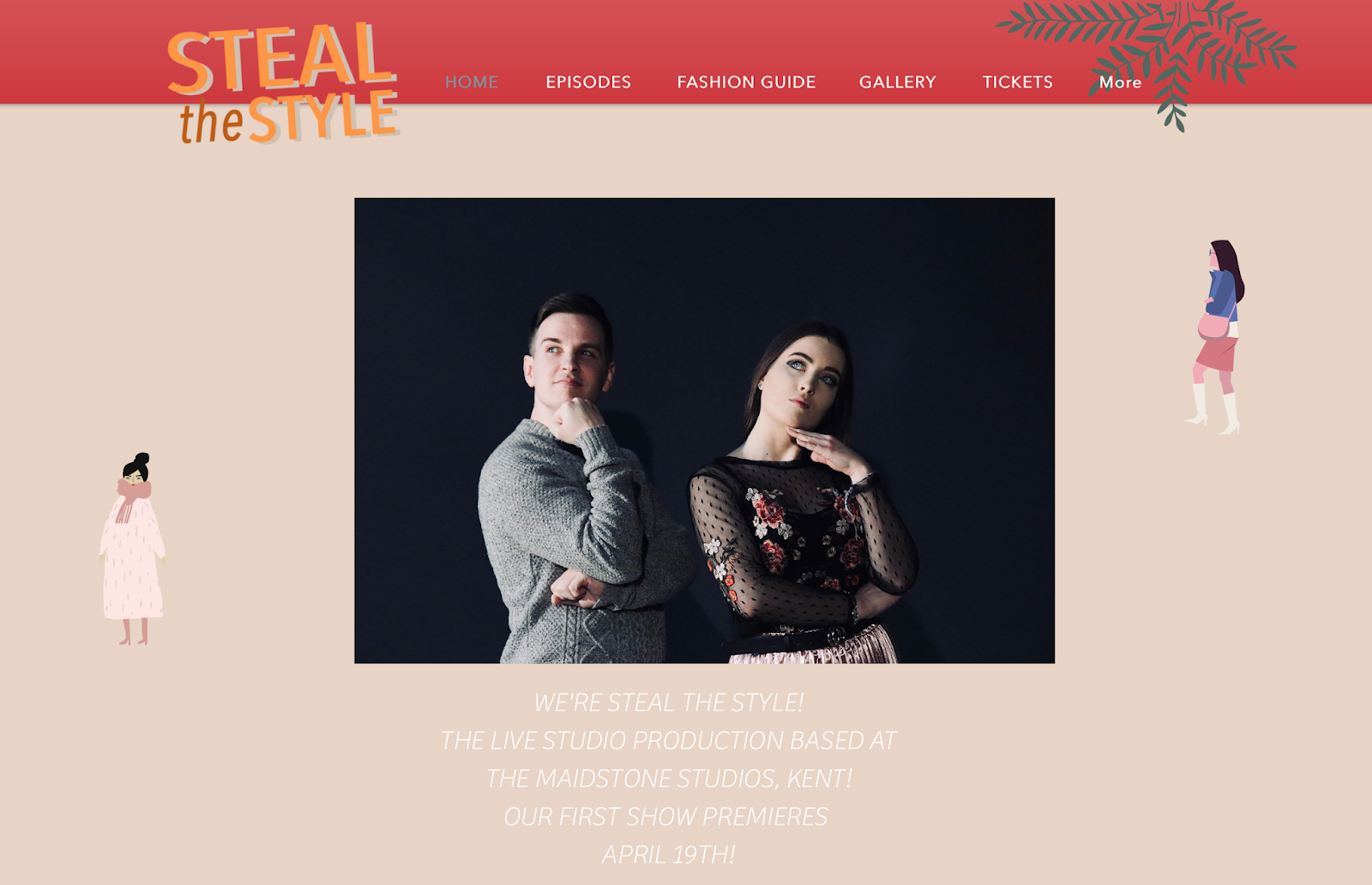
I really liked the design of the website - our brand is very clean cut and simplistic and the website matched that perfectly. The only thing myself and Melissa weren't sure on was the pink colour at the top of the website. Our show is targeted towards both males and females whereas the colour scheme of the website may suggest we're targeted at a purely female audience. The logo on this version of the website also was not the final version so this needed to be updated. I liked the idea of having the presenters on the home screen as they are central to our show and therefore should be present across all Steal The Style promotional content - I also liked the inclusion of the date and location of the show. It was important to remember that not everyone knows what Steal The Style is, so a brief summary helps any visitors to the website get an idea for what the show is about. The website has a page for the episodes of the show, a fashion guide page which features different articles about fashion, a gallery of pictures which also appear on the instagram page and a link to get tickets for the show.
The final website:
The website has now been updated with the suggested changes - the banner at the top is now red instead of pink which makes it more appealing to both genders. I think the website really works as a whole. It would be even better if there were more articles on the fashion guide section so that the website could be a place where the audience goes to get extra style advice.
The FaceBook Page:
The FaceBook page provides a platform for the promo team to inform the audience with updates about the show. The page includes details of when the show goes live, where tickets can be found and a link to the website. It would be good if there are a few posts put up in the run up to the show to get the audience excited for the live broadcast.
The Instagram Page:
I was very keen for us to have an Instagram page as this is the perfect platform to share extra fashion content. I like the material they have uploaded to the Instagram - I think it is a good mix between style advice and promotional content informing the audience of when the show is going live. Like the FaceBook page, it would be good to see an increase in posts in the run up to the show to get the audience excited.
The Twitter:
As with the FaceBook page, Twitter allows the audience to keep informed and updated with the show. Having a Twitter for the show wasn't one of my priorities but I think it is good that the promotional team took this step as it has allowed our show to have a multi platform presence.
Overall, I am happy with the promotional content for the show. I feel that the promo team listened to feedback and made changes where this was possible. I think the trailer could have been stronger with the addition of diegetic sounds and sound effects but I thought the concept of it was really strong. I think the title sequence works very well and sets a good, upbeat tone for the show. I really like the design of the poster with the framing of the presenters, the position of the writing and the contrasting colours. I feel the social media accounts could be utilised better to create more excitement for the show but I am happy with the consistent branding (logo and colour scheme) put across on all the social media sites and feel that this has helped to strengthen the brand identity of the show.