Tuesday, 23 January 2018

'AS LIVE' PRODUCTION: The Pitch

For the pitch, we prepared a powerpoint presentation. Whilst the presentation worked to present our idea and the content for the show, we also designed it to reflect the aesthetic we wanted the show to have.

The presentation included aspects such as the objective of the show, what format the show would take, the individual sections of the show, the target channel, the type of presenters, the technical elements, the set and reasons why we think the show should be commissioned.


As well as the presentation, we had props to help give a clearer vision for the show.

Mel made cue cards with the basic outline of each slide. I made a black and white version of the logo to put on the back of the cue cards. Whilst aiding us in remembering the information, they also showed what kind of cue cards we would give to the presenters for the show itself.


For our idea of having a HOT or NOT board at the end of each section (for the audience to rate each topic hot or not) we brought in an example of the type of paddle which may be used by the audience. On one side there is an flame for hot and on the other there is an X for not. The aim of this was to display the panel how this element of our show would work.


To accompany our digital design of the set, we also brought in a 3D model. This shows how the set would actually work and could also be used to help figure out lighting and camera angles. It helped to bring the vision of our show to life.


After we pitched our idea we received feedback from the panel.

The panel all really liked the idea. They thought the concept was good and that they could see it working as an idea.

Del thought that the hot or not board / paddles was not needed - everything else seemed quite professional and high quality expect for that aspect. Myself and Melissa took this on board and were happy to get rid of this idea. Del also questioned whether this idea really needed to be in a live studio setting - we thought it was good for audience participation but Del was not sure. He suggested having the audience stood around the set in a Top Gear style and potentially touching / trying on the trends of the week at the end of the programme.

Josh thought the idea was good but instead of aiming for Channel 4 he suggested that we aim for E4 instead. As this was one of the broadcasters we already considered, we were happy to change the target channel.

Our pitch was so successful that it got commissioned to be the studio produced.

Now myself and Melissa need to get ready to pitch the idea to the rest of the group and decide what needs to be done next to get the idea brought to life.


Friday, 19 January 2018

'AS LIVE' PRODUCTION: (Research) Looking Into Our Segments

Trends of the Week

Although we are not picking trends for the pitch (as the current trends will be different to the ones for the time of broadcast), I thought it would be good to get an idea of where these trends can be found.

Trends can be seen on catwalks, in magazines, through celebrity street style, social media influencers and other fashion programmes.

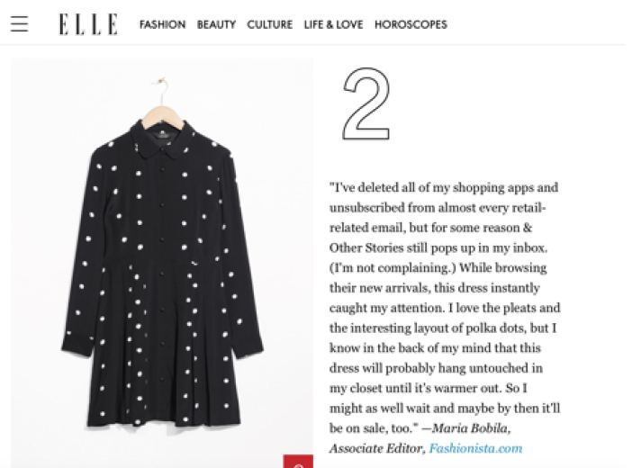
Elle Magazine did an article on current trends - this is one example of how we will find fashion trends for the programme.

https://www.elle.com/fashion/g15562179/8-things-we-wanted-to-buy-this-week-but-didnt/


Social Media influencers are often sent current trends to promote for brands. This provides a good platform to get inspiration for current fashion trends which magazines might overlook - helping us to fit with our aim of providing unique, anti-mainstream fashion advice.

This is an example from fashion blogger Lissy Roddy - promoting a current trend for the brand Lasula Boutique.


The presenters will discuss the current trends for each gender before focusing on one trend and showing how this can be styled with other items from the high street to create an on trend yet original look. This is followed by a VT where a reporter will go around high street stores to show where this trend can be found for the best price. This trend is then voted hot or not in the studio by the audience with paddles - the trend is then placed on the hot or not board.

Not on the High Street

During a feedback session on our idea with Helen she suggested looking into small independent businesses as this fits with our idea of looking at the non mainstream side of fashion. Small independent stores / businesses usually have a limited number of items with the same design, meaning the customers can find more original / unique items.

Melissa went out into Margate to get an idea of what sort of clothing is available in independent stores and therefore whether this would work as a segment. She found a few different independent stores which all stocked different types of items - this would be perfect for this segment as we would be able to use a VT to explore these different stores and show to the audience where they can find more unique and original items to help them stand out from the crowd (which is one of the aims of our show).


The studio part of this section would feature an interview with an independent store owner who will be questioned on topics such as what they sell, where they get their inspiration for their designs, what they feel independent stores offer over mainstream chain brands and the pros and cons of running an independent store. The VT will go out into the guest's store (and potentially other independent stores) to show what they sell whilst providing the audience with information on how to support local businesses like these. Customers in the store could then be interviewed on their opinion of independent stores which will hopefully help the audience to relate to the topic as they can identify with the customers.

At the end of the section, the audience will rate the topic of 'independent stores' hot or not - the topic will then be placed on the hot or not board.

Very Vintage

Since there has been a rise in vintage fashion (http://www.bbc.co.uk/news/uk-england-17667524) we thought it would be a good idea to include this as a segment in the show. Buying vintage / retro / thrifted clothes increases the chances of the items being unique as some of the items are one of a kind or were only available a long time ago meaning very few people will have the same piece. This fits with the premise of the show as vintage items aren't mainstream and will help our audience dress differently from the crowd.

Videos about thrifting have been very popular on YouTube but the topic has barely been discussed on TV - this shows an opening in the market for this topic to be discussed and also adds to the idea that our show is unlike anything seen on TV before.


Personally, the only issue I have had with buying vintage clothing is not knowing where to look to find the best items for the best price. Therefore, this section can be used to inform the audience about where they can go vintage shopping and how they can find the best pieces.  The studio section of this segment would involve the presenters discussing their top 5 tips on shopping in vintage markets. The accompanying VT will then be a fun challenge where the presenters go out to a vintage market with a budget and try to piece together an outfit following the tips they have just provided in the studio. They could either buy the outfit or just take a picture in the outfit and display it to the studio audience back in the studio - the audience will then rate one outfit hot and the other not which will then be placed on the board.

Vintage Fairs often travel around the country. London is possibly the closest / easiest place for people to travel to. There is a Vintage Fair in February in London which could be used for the VT if the idea goes ahead.


Digging through the wardrobe of...

The idea for this section came from my original idea of a style swap programme (which was inspired by a Made In Chelsea segment where members of the cast go through each others' wardrobes and piece together an outfit they think is in the style of the person who's wardrobe it is).


We want to take this idea but just show (in a VT) a guest and a reporter going through the guest's wardrobe exploring what key pieces they have, what they can't bear to get rid of, what their oldest items is, what their newest item is etc. Back in the studio the guest will join the presenters along with one item from the VT and talk about where they bought it, why they bought it and how they would style it before the presenters provide the audience with advice on where similar items are available.

The guest would potentially be a small fashion blogger or someone with an original sense of style.

The section will finish with the audience rating the outfit pieced together by the guest 'hot or not'.


'AS LIVE' PRODUCTION: Set Design

In order to give the clearest vision for our show as possible, we decided to draw up a set design. This will display to the panel how feasible our show is in terms of the space and set we need - the set design shows how all the elements of our show will work in the studio environment e.g. how the HOT or NOT board will work and how the interview sections will take place. This will also help to map out camera and lighting positions.

Firstly we set about deciding the dimensions. Having worked on last year's production, we decided we wanted a similar size as this seemed to work well for both the talent and the cameras / crew. We decided to stick with the 3 flats but decided we wanted an extra wall coming out from the back flat. This creates a point of interest in the set, provides somewhere for the on set TV to go and also allows a concealed doorway for the guests. The elements we needed to include in the set were; a doorway, a seating area for the presenters / guests and the hot or not board. All other elements are to aid the brand identity.

To reflect our unique / original brand identity we wanted our set to have a rustic / wood / brick feel as this is generally unseen on TV programmes. The aesthetic we wanted to go for is a similar to the pinterest / tumblr room with muted colour, rustic brick, exposed bulbs, plants, clothes rails etc. To display to the panel the feel we want our set to have we put together this mood board. The mood board also shows 2 TV sets which have a similar look - both of which are chat shows. Both sets use a simple / minimalist set up which supports the look we are aiming for with our show.


Then to show how these elements work in a set design we decided to draw up a digital version of the set. For seating we decided on having high stools - this is so that the presenters / guests can be sat down but still be visible to the audience (as the audience is all on one level). We had considered having the presenters stood up but this would feel too unnatural for a relaxed chat show.


Whilst I made the digital version of the set, Melissa made a miniature model. This can also be used to help work out camera and lighting positions as it shows the set in a 3D model.


DISSERTATION: Briefing

Draft: 23rd March

Deadline: 11th May

Writing
Production

Formalism - the elements that make up and structure the films 'form'

Editing - continuity (axis of action, shot reverse shot, classical hollywood - Alfred Hitchcock) Discontinuity (soviet montage), art house cinema (Jean Luc Goddard), Avant Garde / Experimental (Stan Brakhage)
Set design
Cinematography

Realism and Social Realism
- documentary modes
- poetic realism
- neo-realism
- british realist
- social realism
- sociology of urban spaces, class systems etc

Auteurship
- Francois Truffaut (auteur policy, 400 blows)
- Andrew Sarris (three concentric circles of: technique, personal style and interior meaning versus metteur-en-scene)
- Roland Barthes (death of the auteur)
- Auteur structuralism (Wollen - author as unconsciously channelling social conventions)
- Post-auteur

Genre Theory

Formal elements:
- iconography
- tone
- narrative elements
- plot
- themes
- archetypes

- Rick Altman: Semantics
- Thomas Schatz: Social Order
- Steve Neal: Difference and repetition of formulas, familiarly and innovation

- Categories
- Sub genres and hybridity
- Canon formation, revisionism and cycles
- allegory and metaphor
- industry and audience

National Cinemas, Art Movements, Transitional Cinema
- British New Wave
- French Impressionism and Surrealism
- Soviet montage
- Italian Neorealism
- German Expressionism
- French new wave
- new german cinema
- new mexican cinema
- new hollywood and independent american cinema
- hong kong cinema
- iranian new wave

Spectatorship

Psychoanalysis
- Male Gaze in Vertigo (Laura Mulvey theory)
- Phallic symbolism in Slasher films (Carol Clover theory)

Feminism
- Male Gaze in Vertigo
- Postfeminist and Consumer choice of branding, beautification and neoliberal exploration in New Femininities: Post feminism, neoliberalism and subjectivity
- Androcentrism - Simon de Beaviour, Mary Ann Doane, Film and the masquerade 

Representation
- Class
- Sexuality
- Gender
- Masculinity

Post colonialism, multiculturalism, race and ethnicity
- orientalism - Edward Said
- Third cinema versus Eurocentrism
- Racial Gaze
- Positive and negative stereotypes

Digital cinema
- manipulation of spaces and early effects
- perceptual realism and photorealism
- persuasion tactics and paratexts
- remediation
- motion capture and performance
- humanness and technology
- codes and contestable mapping
- transmediality
- participatory culture and citizen journalism
- convergence and spreadable media

Animation
- early animation
...

Industry, production, distribution:
- commercialism, globalisation, marketing, ratings, franchises, money and spectacle

Hollywood Studio System: 1920s-1960

Art and Fashion in Film and TV
- art history
- surrealism
- dadaism
- situationism
- mannerism
- cubism
- abstract modernism
- deconstructionist
- precisionist
- renaissance linear perspective
- rococo
- punk, mods, grunge, indie

Stars and Stardom
- star system
- studio system
- celebrity studies
- star personae

Audience reception
- codes of behaviour
- sources
- hypodermic needle model
- Stuart Hall - encoding / decoding 1980

Politics and political economics
- globalisation, neoliberalism, free markets
- Marxism and the Frankfurt School - ideology, base and superstructures, the hypodermic needle model, hegemony (gramsci), carnivalesque (bakhtin)

Structuralism and post structuralism
- semiotics - signifier and signified
- mythology (levi strauss)
- deconsturtcuon
- post modernism

Phenomenology and embodied spectatorship
- haptic visuality
- carnal senses

Film and TV history, cultures, criticism, festivals...

The proposal is an outline of the approach and the shape that you long dissertation will take - get to grips with the subject

Introduction - set up and prepare the reader, introduce and explain the main focus and aim/ question
Clarify areas of research in your dissertation

The main body (chapter 1,2,3) - explores

Chapter One - the beginning
Definition of terms used in the intro

Chapter two - the middle
Utilises and builds on information from chapter one
Application of theories, current discussions / context
Any information and ideas that need to be discussed before the question cane fully answered or the aim fully achieved in the final chapter

Chapter Three - the end
- Where the question is fully answered or aim fully realised

Conclusion - End on very last, final response on the discussion
- Reiterate the aim of your dissertation, reminding the reader of any questions you were intending to answer

For the three chapters, think about how your proposal will outline the organi.....

Start from a clear, focused and research informed question or statement of intent
Needs to be theoretically informed
Offer several opportunities for analysing view points

Avoid question being something you thought up from thin air or where you already know the answer

Break down the Q
- appropriate questioning term e.g. what (define), and to what extent (gauge)

A dissertation question can then be broken down between chapters

Progress through the chapters

The evidence must be relevant to the specific discussion point of the paragraph

Critically evaluation / analysing the evidence involves thinking about the evidence and coming to your own conclusions regarding the significance of it, this is important when using to illustrate or support a discussion point

Prepare a synopsis and provisional bibliography for first tutorial 

Ideas:
- Friends - set design, acting, production

- Cinematography : The Great Gatsby, The Grand Budapest Hotel

- Diversity in films - white males

How cinematography is used in Baz Luhrman's films to create...

Suggestions: Formalism, auteurship


Thursday, 18 January 2018

'AS LIVE' PRODUCTION: (Lecture) Pitching

Pitching

- Inevitable part of programme making

- develop idea for pitch
- prepare proposal
- pitch
- answer questions
- make use of pitching sessions

What is the purpose of a pitch?
- to allow the opportunity to deliver presentation of idea and flesh it out so your audience can visualise the film / show
- chance to get feedback and find out what works and what needs improvement or changes


What should you do before a pitch?

Research idea to ascertain its:

- strengths
- weaknesses
- opportunities
- threats

Develop fully formed proposal which will stand up to questioning.

Preparing Proposal

Your idea must have an OBJECTIVE.

Write this into proposal which is in present tense and has an 'active voice'. This is a written representation of the visuals and your treatment.

What happens at the pitching session?

Allotted amount of time in which to convey your idea

Pitch to most senior members of the programme or to relevant channel commissioners or development executives


Suggested elements:

- Outline initial intentions and ambitions
- Working title and location (VTs - where are they?)
- Idea in one sentence
- Synopsis of idea - clear overview of programme, content, contributors, VT, style
- Target audience & channel - research / data to explain that
- Style & tone - virtual mood board - colours, mood, tone, central & minor characters - show access / agreements / research already in progress
- How format adds to the programme storytelling and USP
- Why programme should be commissioned
- Running order
- VTs
- Basic camera / floor plan

How should you present your pitch?

Use visual aids - provide guidance / structure

Show example of clips of similar / existing content which could illustrate what it is going to be like

Logically - go through step by step

Check viability of idea - includes knowing that important elements of your idea can actually happen
Contact contributors - check viable to use them

Body language and style

Think about appearance and pace of the pitch

Prepare and rehearse

Be enthusiastic - add colour

Emphasise USP

Responding to Questions

Be prepared to expand on presentation - have more detail available

Take your time

Facts and figures

Remain positive even if you don't have the answer

Pitching dos and don'ts

Do's
- be brave and surprise
- passionate and engaging
- challenge conventions
- top line
- know existing output and spot opportunities
- develop a dialogue with commissioners
- pitch ideas and stories not subject matters

Don't:
- send lots of ideas
- patronise editors with gimmicks
- water down idea too soon
- make promises you can't keep
- ensure ideas worked up
- worry about fancy presentations

How you can make criticism work for you:
- take on board comments and consider how you can incorporate them

Wednesday, 17 January 2018

'AS LIVE' PRODUCTION: Establishing the Brand

In order to give our show a sense of having a 'brand', we decided to come up with a colour palette and some example titles.

To give an idea of existing colour schemes and title sequences, I had a look at the branding of some existing popular tv shows.


The branding for Gok's Clothes Roadshow is targeted towards a female audience. Although the majority of the logo is in monochrome colours, the hanger having from 'roadshow' is in pink. I like the idea of using simple monochrome colours for the text but then using some accent colours around it to stand out. We could do this with our logo by making 'Steal The Style' monochrome in colour and then using other colours around the title to act as little accent colours.


The branding for Loose Women is targeted towards a female audience. This is apparent through the logo as the main colour is a red / pink. The other colours (green and yellow) are in a slight pastel colour which can be considered more feminine than the use of bright, bold colours. The title of the programme also suggests the programme is for women. I like the idea of using boxes around the words in slightly different variations of the background colours, I also like the idea of using two slightly different fonts for the logo. We could use elements of this in our logo by choosing variations of the background colours for the boxes around the text and by choosing slightly different fonts for the text.


The branding for Lorraine can also be seen to be targeted towards a female audience. The main reasoning behind this is the pink colour used for the text. I like the simplicity of the logo, however, I think this will be too simple for our show. Fashion programmes tend to have a more complex logo (such as Gok's Clothes Roadshow, Project Runway and RuPaul's Drag Race) whilst the chat show programmes tend to have a more simple logo (such as Loose Women, Lorraine and This Morning). We could use elements from both types of logo as our show is a fashion chat show (a combination of the types of show who's logos I have researched). I like the idea of using a san serif font for the text to give it a more modern, contemporary feel but combining it with ideas from the more complex logos like a slanted box around the words such as that used in the Project Runway logo.


The branding for Project Runway is targeted towards a female audience. This can be deciphered from the prominent use of the colour pink in their logo. The slant of the logo simulates that of a runway - linking the logo to the theme of the programmes. I like the idea of using subtle techniques like this to link the programme with its logo - a similar technique could be used in our logo.


The branding for RuPaul's drag race is the brightest and boldest one I have researched. The bold pink colour, the graphic of the tiara and RuPaul's outfit (as well as the show's subject matter) would suggest the target audience being those interested in drag. Research has shown that 'heterosexual girls (and a lot of them quite young) almost match the gay man target audience one-to-one' [1], the logo reflects this audience demographic. I like that the logo embodies the theme of the programme, I would like to do something similar with our logo, however with a less complex design.


The branding for This Morning is very gender neutral in terms of the colours chosen. The green does not exclude males or females, therefore the branding suggests the programme is suitable for any gender audience. The scheduling, however, suggests that the programme is targeted towards house wives due to the mid morning time slot. In our logo, we will use gender neutral colours as we aim to cater for both males and females and therefore do not want to exclude either gender with our branding.

We wanted to ensure that our show appeals to both males and females, therefore the colours we have chosen for our colour palette are neutral and non gender specific e.g. we have stayed away from the pink and blue colours so that no one is excluded by the colours used. This is the colour palette we were aiming for:

Example titles:

Myself and Melissa both had a go at creating the logo for the show. We then would choose the design we liked better and thought would suit the show better.

Melissa's original ideas:


Melissa originally had the idea of incorporating hangers into the logo so establish the theme of fashion and clothing. I really liked this idea and feel that it is a lot more complex than my design, however, we were unsure how to incorporate colour into the logo (something it would definitely need).

My original ideas:


Originally I had the idea of using hangers in the background - this is for the same reason Melissa used hangers in her design - to establish the theme of clothing and fashion. I like the changing background colour so I also used this in my other idea for the logo.


For my second idea, I decided to create different graphics - keeping the title in the same position but changing the colours and design of each graphic. The colours used in the graphics are from the colour palette - so all the colours are neutral and do not exclude either gender.


To go along with the logo / opening titles - I decided to make a sting which would be used to introduce each segment of the show. It has the same theme as the opening titles to help establish the brand - the repetition of the colours and the same style of music helps to build the brand.


Originally I had wanted to use a dark, muted pink colour for one of the backgrounds, however, we agreed this would be too feminine and may exclude the male audience. For this reason, this pink colour got replaced with the red background.

This research has shown me the importance of colour in the branding and target audience for the show. The branding has the power to influence who feels welcome to watch the show and which audience is suitable for the subject matter. Following this we chose a neutral colour palette for our audience of males and females.


Sources:

[1] https://medium.com/clippings-autumn-2017/almost-half-of-drag-race-fans-are-straight-girls-according-to-research-616ff76a4c02


Tuesday, 16 January 2018

'AS LIVE' PRODUCTION: Studio Visit

To help us get a picture of what sort of set we would like to pitch, we visited studio 2 today - the studio where we will film the live show. Myself and Melissa were thinking of having a very simple set, similar to last year's with 3 flats making up the structure of the set. However, visiting the studio has enabled us to see what other options are available. There is enough space to have multiple sets which would mean we could have a comfy area with sofas and a table for the chatty elements of the show, an area dedicated to the clothes with clothes rails and other fashion storage and potentially a catwalk set. The presenters could move between the sets which would inject more variety into the show.

There would be a few issues with having different sets:
- we would have to consider where the audience would sit so that all the sets are visible to them
- we would have to consider how the sets would be lit, this would be a lot more complex than if there was one set to focus on
- cameras would potentially have to move around more, creating more opportunities for things to go wrong (e.g. cables getting unplugged / causing trip hazards where equipment could potentially get broken or people could get injured).


The set could either face coming out of the back wall of the photo above or to make a wider set it could face coming out from the wall to the right of the photo. The set can not block the door into the studio as this is used as a fire exit.

Risk Assessment:
- the set can not block the fire exits in case of emergency
- wires will need to be taped down to prevent people tripping and injuring themselves or damaging the equipment - if camera wires can not be taped down they should be wrapped up and held by a camera assistant.
- all camera operators should map out their movements before moving cameras to ensure there is no risk of tripping