
The Trailer
As a mock up, the promo team produced this trailer:
This mock up was to display their idea for the trailer to us. I really liked the concept of the trailer and could see it working with our presenters 'stealing the mannequin'.
Feedback:
- Needs to enter shop quicker
- Needs more diegetic & non diegetic sound during the shop section
- Needs to be more fast paced - higher energy
- Like the idea of zooming in on his face when he sees the mannequin
- The photoshoot section at the end was too long - needs to be cut down - more fast paced
The promo team then produced their first rough cut of the trailer with the presenters:
I really liked how the idea was coming together. This version was definitely more fast paced than the mock up and works better because of it.
Feedback:
- Needs music to help the pace
- Needs diegetic sound of the shop environment
- Could potentially include some non diegetic "swoosh" sound effects for when the camera zooms
- The footage is grainy - can this be resolved or re shot?
- Should there be some voice over at the end with the time and date of the production?
The promo team re shot some of the sections and put out another rough cut of the trailer:
Feedback:
- The colour is looking a lot better
- No grain which is good
- More fast paced
- Still no diegetic sound e.g. footsteps, door opening, shop environment sounds? Feels like there should be some sort of atmospheric sounds
- The logo at the end needs to be updated.
The promo team used the feedback to come up with the final version of the trailer:
Overall I am happy with the trailer, it captures the light hearted tone of the show and alludes to the title 'Steal' The Style. The trailer has definitely improved through the edits - with the noticeable difference being that it is much more fast paced and high energy. I also like how the outfit on the mannequin ends up being her outfit for the show - making everything link together. The non diegetic background music is good and again fits the tone of the show. I would have liked some diegetic sounds of the shop atmosphere and some sound effects for the camera zooms as it does feel a bit flat, however, I understand that the team did not film these elements when they were out on shoot so could not add these in during the edit.
The Opening Titles
Initially we were unsure whether we wanted graphics based titles or a specially shot title sequence. We decided to go for this specially shot sequence as the promo teams gave some really good ideas for this in production meetings.
Rough cut:
I really like the title sequence and thought they had a very polished rough cut straight away.
Feedback:
- Maybe remove the section with Alfie rolling on the floor - doesn't fit with the tone of the rest of the titles - will also make it faster paced
- The transition between the upbeat music and elevator music could be smoother
- Colour correction still needs to be finished
- Logo at the end needs updating
- Could cut down the length of time the presenters are walking towards the camera at the end
The promo team implemented our advice and produced the final version of the titles which will play at the beginning of the show.
Final show version:
The title sequence turned out very well and the promo team took on board all of our feedback. The team have left enough time at the end of the titles for Aimee to fade the music out in the studio, this will help the transition from titles to studio go as smoothly as possible.
The Poster
For the mock up, the promo team suggested a few different designs they could do for the real poster.


I personally wasn't keen on any of the designs as I found it hard to picture how these posters would work with our presenters in them. However, once the promo team showed us the first version of the actual poster, I was very impressed.
First Version:

The composition of the poster really works well, the only thing that needed to be changed on this poster was the logo - however, we hadn't yet finalised the logo.
Second Version:

We finalised the logo with the graphics team and created a white version to go on the poster. However, other departments began to use this white version of the logo as well when it was only intended for the poster. We then decided it would be best to keep the colour of the logo consistent over all products to prevent confusion - we fed this back to the promo team who changed the logo to the original orange version. We also fed back that it would look better if the logo was straight instead of slanted - the promo implemented this feedback.
Final Version:

I really like the final version of the poster. I like the contrast between the purple colour of the background and the orange of the logo which makes the title of the show stand out.
The Social Media Accounts / Website
As well as the other promotional material, the promo team made a website social media accounts for the show.
Rough website:

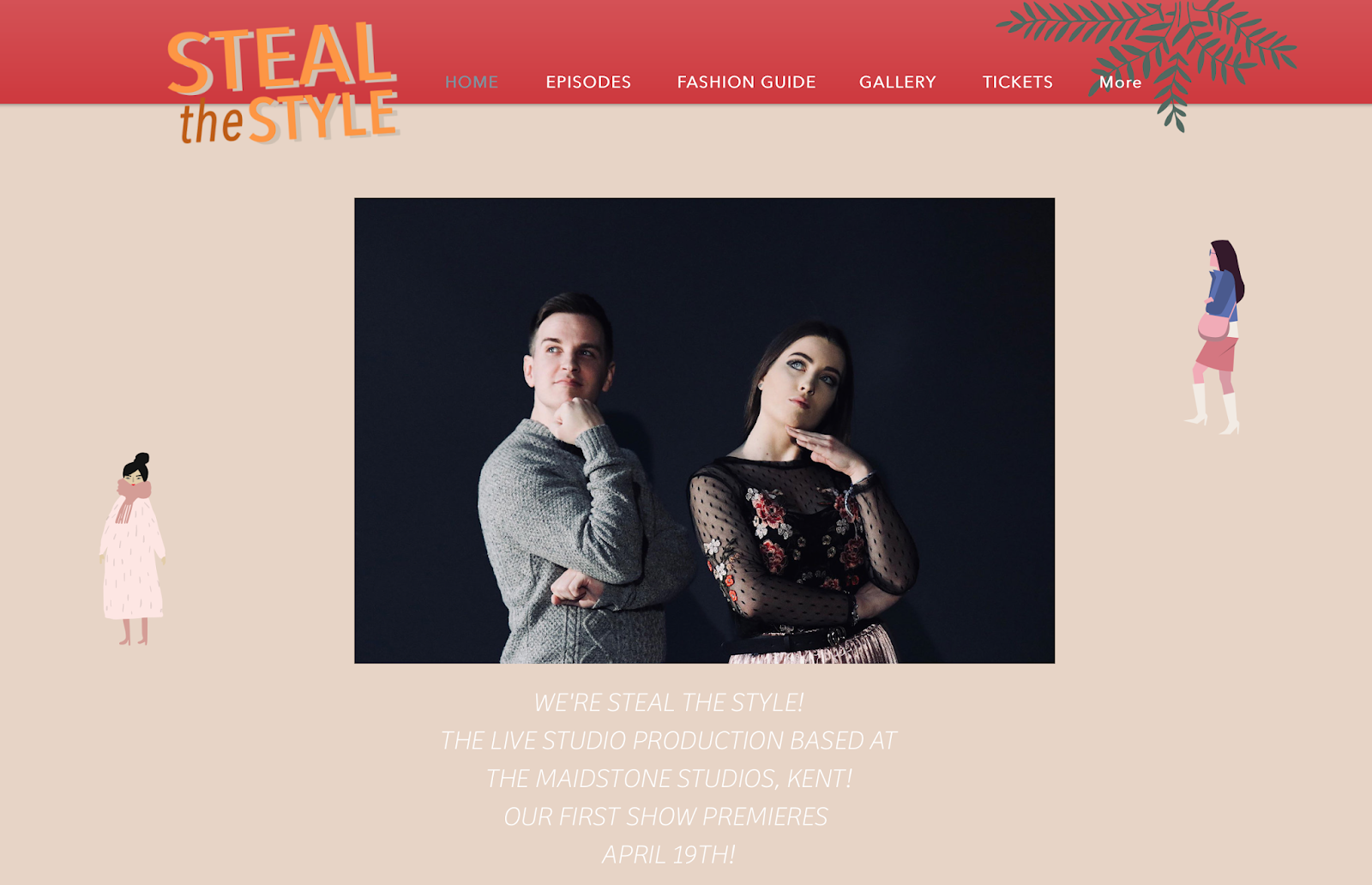
I really liked the design of the website - our brand is very clean cut and simplistic and the website matched that perfectly. The only thing myself and Melissa weren't sure on was the pink colour at the top of the website. Our show is targeted towards both males and females whereas the colour scheme of the website may suggest we're targeted at a purely female audience. The logo on this version of the website also was not the final version so this needed to be updated. I liked the idea of having the presenters on the home screen as they are central to our show and therefore should be present across all Steal The Style promotional content - I also liked the inclusion of the date and location of the show. It was important to remember that not everyone knows what Steal The Style is, so a brief summary helps any visitors to the website get an idea for what the show is about. The website has a page for the episodes of the show, a fashion guide page which features different articles about fashion, a gallery of pictures which also appear on the instagram page and a link to get tickets for the show.
The final website:
The website has now been updated with the suggested changes - the banner at the top is now red instead of pink which makes it more appealing to both genders. I think the website really works as a whole. It would be even better if there were more articles on the fashion guide section so that the website could be a place where the audience goes to get extra style advice.
The FaceBook Page:

The FaceBook page provides a platform for the promo team to inform the audience with updates about the show. The page includes details of when the show goes live, where tickets can be found and a link to the website. It would be good if there are a few posts put up in the run up to the show to get the audience excited for the live broadcast.
The Instagram Page:


I was very keen for us to have an Instagram page as this is the perfect platform to share extra fashion content. I like the material they have uploaded to the Instagram - I think it is a good mix between style advice and promotional content informing the audience of when the show is going live. Like the FaceBook page, it would be good to see an increase in posts in the run up to the show to get the audience excited.
The Twitter:

As with the FaceBook page, Twitter allows the audience to keep informed and updated with the show. Having a Twitter for the show wasn't one of my priorities but I think it is good that the promotional team took this step as it has allowed our show to have a multi platform presence.
Overall, I am happy with the promotional content for the show. I feel that the promo team listened to feedback and made changes where this was possible. I think the trailer could have been stronger with the addition of diegetic sounds and sound effects but I thought the concept of it was really strong. I think the title sequence works very well and sets a good, upbeat tone for the show. I really like the design of the poster with the framing of the presenters, the position of the writing and the contrasting colours. I feel the social media accounts could be utilised better to create more excitement for the show but I am happy with the consistent branding (logo and colour scheme) put across on all the social media sites and feel that this has helped to strengthen the brand identity of the show.
No comments:
Post a Comment