It made most sense for me to take the pictures for the poster as I have been the DOP throughout the project and, therefore, know the visual tone of the production better than the other crew members. Being in control of capturing and tweaking the colours of the images means that I can ensure the visual tone of the promotional picture matches the visual tone of the production.
Whilst the production is all naturally lit, I decided to artificially light the image for the poster as this fits the convention for film posters - the posters are usually of high production quality and by lighting the images artificially, I ensured the characters could properly be seen and that the detail of their costumes / props were apparent to the audience so that the veterinary theme of the production is established. The lighting also makes it clearer to see the expressions of the characters which helps to suggest their characteristics within the production (i.e. Tim has a superior look on his face to reflect the high view he has of himself in the production, whilst Luke's expressions are either that of shock, happiness or confusion which, again, corresponds with how his character acts within the production).
The bright look of the images also helps to establish the medical / veterinary theme of the production - this helps to establish the theme of the sitcom whilst their facial expressions work to suggest that the production is in fact a sitcom.
A section of the original images I took are shown below. They were taken on a Canon 700D with an ISO of 800, aperture F/7.4 and a shutter speed of 1/60. They were lit by two aputure LED lights with a cool colour panel on the front and at a power of 80. This works to give a professional studio look:
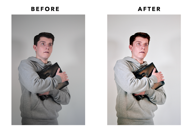
I then edited each of these photos so that the colour tone of the production continued through to this promotional material. To edit these photos I altered the following settings (I used the same settings for each photo as they were all taken with the same settings so the same look could be achieved by applying the same adjustments):
Brilliance: +0.45
Exposure: +0.25
Highlights: -0.04
Shadows: -0.23
Brightness: +0.13
Contrast: -0.13
Black Point: +0.24
Saturation: +0.33
Contrast: -0.48
Cast: -0.08
I then adjusted the RGB curves subtly give the photos an orange and teal tone (like the production).
As well as adjusting these curves, I adjusted the different colour hues, saturation and luminance in order to add to this orange and teal tone whilst retaining the definition of the details within the images.
The following images show the before and after shots:
I have shared these images with the rest of the crew. Alex will be creating the poster and will make further alterations to the look of the images so that they fit with the style of the poster - my alterations are just a starting point / base for the final product. Alex will need to ensure the image fits with the graphics that will be going on the poster - we have mainly used black, red and white in our graphics so this will carry over to the poster and the images used will need to be consistent with this look.


No comments:
Post a Comment