
Colour correcting is performed prior to the colour grade - the purpose of the colour correction is to balance the colours and "making sure footage looks exactly the way that the human eye sees things". [1] This gives a good base image to work off in order to get the best result from the colour grade. The most practical way to perform colour correction is to ensure the "white and black levels match what the human eye sees as white and black, then the other colors should be balanced as a result". [1] Using this method gives you something to focus your attention on so that you are not overwhelmed by the wide spectrum of colours apparent in the footage - instead, you are just focusing on two block colours which in turn will affect the other colours within the footage.
The below image demonstrates how colour correction alters the appearance of footage. The raw footage appears washed out and unsaturated. The colourist has corrected the colour by making the black appear black and white appear white to the human eye, whereas, before the correction, it can be seen that the black appears a faded grey colour. Once this black and white had been restored, the dimension appears to have been brought back to the image instead of it appearing flat. With this added contrast / dimension, the skin tone of the woman has also been brought back to a natural colour and exposure which would be true to that seen by the human eye. Correcting this colour allows a good base for applying the colour grade as if all the footage is corrected using the same base measures (i.e. correcting the blacks and whites to appear black and white to the human eye in every piece of footage) this should result in a similar tone being created across the production as a whole which then means the grade will also appear consistent across the production.

To colour correct in Premiere Pro, there are several different methods which can be used to achieve different looks. Some of these tools are more useful when it comes to performing tasks such as colour grading rather than colour correcting as they allow more in depth colour manipulation than the simple colour correction tools. As I want to focus on the colouring of the project more in the colour grading process, I decided to focus my research on the simple method of colour correction as I only needed to use this process to match up the clips in order to create a consistent look (rather than using these tools to create a specific visual effect).
I used tutorials as research as this displayed exactly how colour correcting can be performed in Adobe Premiere Pro. The tutorial I focused on can be found on this blog;
https://creativepro.com/premiere-pro-tutorial-simple-color-correction-for-video/
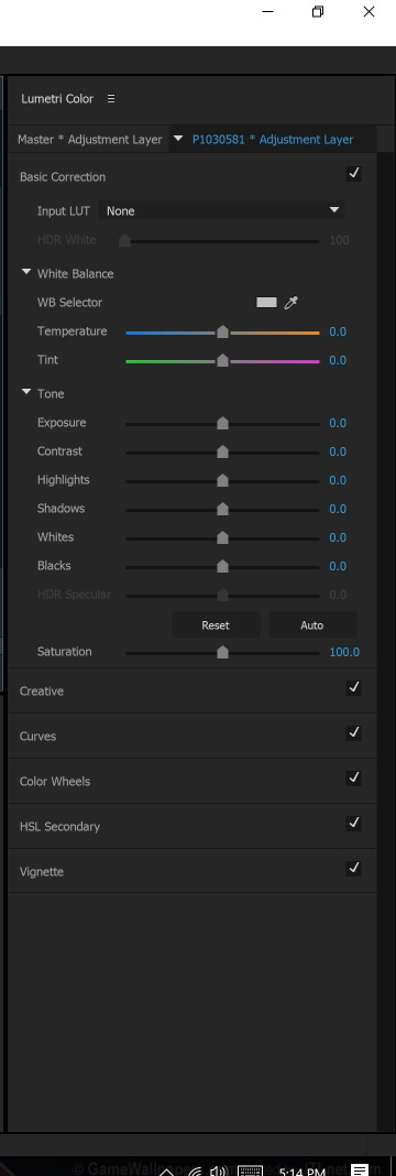
To perform simple colour correction on a clip, the effect controls can be altered in the lumetri colour tab by selecting the basic correction option. This allows you to then manipulate the look of the clip in terms of the colour temperature, tint, exposure, contrast, highlights, shadows, whites, blacks and saturation. These settings (in particular, the exposure, contrast, highlights, shadows, whites and blacks) can then be used so that the blacks appear black and the whites appear white to the human eye - once these areas of the footage have been corrected, the colours within the footage should also become balanced. If not, tools such the temperature scale and tint scale can be altered to adjust the tone of the image in terms of the blue, orange, green and purple tones. When using these tools, the focus should still be on the whites and blacks of the image so that they still appear true white and true black when adjusting these settings (instead of taking of the whites and blacks taking on one of these tints which would then give the image an unbalanced look).
Adjusting these settings should mean you are able to produce a balanced and corrected image that is true to the colours seen by the human eye. However, sometimes a truly balanced image can not be achieved through these settings as there are not many tools to adjust the colour (just the blue, orange, green or purple tints). This means that a better tool to use when adjusting colour (or to even apply a colour look) is to use the RGB curve. This allows you to specifically adjust the red, green and blue tones in all the different areas of the image (highlights, midtones and shadows) rather than just adjusting the image as a whole which is what the temperature and tint settings do. With the RBG curves, you can adjust each red, green and blue curve to adjust the highlights, midtones and shadows by selecting the corresponding point on each line (i.e. to adjust the shadows, you adjust the bottom end of the curve. To adjust the midtones, you adjust the middle point of the curve. To adjust the highlights, you adjust the top end of the curve). For each curve you can move the point up or down to adjust the colour. By doing this on the red curve - dragging the selected point up increases the level of red in this area of the image and dragging it down decreases the level of red in this area of the image by increasing the level of green in this area of the image. By doing this on the green curve - dragging the selected point up increases the level of green within this area of the image and dragging it down decreases the level of green in this area of the image by increasing the level of purple in this area of the image. By doing this on the blue curve - dragging the selected point up increases the level of blue in this area of the image and dragging it down decreases the level of blue in this area of the image by increasing the level of yellow in this area of the image. As already stated, this can be used to correct the image so that the colours are accurate to those seen by the human eye. Additionally, this tool can be used to give the image a specific colour look, similar to that of a colour grade. By adjusting these curves further than necessary to correct the colours in the image, the areas of the photo then begin to take on these colours in a stylistic effect. So if you wanted to manually create the infamous orange and teal look which is prevalent in Hollywood releases, you can do so by increasing the level of blue and green within the shadows of the image by adjusting the lower half of the green and blue curves. The highlights and the midtones of the red curve can then be increased slightly, as well as decreasing the level of blue in the highlights and midtones to give a more yellow look. When these settings are combined, the shadows are given a teal look, whilst the highlights and midtones are given an orange look - manually creating the orange and teal effect.

"LUT stands for Look Up Table. In short, LUT is a table used to map one color space to another." [2]
LUTs are specially formulated to recognise colours within a clip and map their preset over these colours to achieve the set out look. (i.e. the LUT I will be using for my colour grade is an orange and teal LUT. This has an orange and teal colour map which recognises the highlights, midtones and shadows of the targeted clip and applies its preset over this to produce the stated orange and teal look.)
LUTs can be used in a variety of different ways; log normalisation LUTs, film emulation LUTs and creative LUTs. Each type and method of using LUTs serves a different purpose. As I am using a LUT to colour grade (rather than restore the log look of an image), I am using a creative LUT to give my footage a specific colour look. Creative LUTs are used to give specific creative colour looks - or they act as a starting point for these creative looks if further manipulation needs to be performed through the RGB curves. An example of a creative LUT being applied to properly exposed and corrected footage can be seen below [2] :

The effectiveness of LUTs is affected by the original clip that it is being applied over. A LUT cannot correct an overexposed image or an image where the colours appear unbalanced as they are only programmed to apply their preset over the existing image. Therefore, colour correction needs to be performed first and be layered under the LUT in order for the colour grade to be effective. The colour correction should not be applied after as this will also affect the look of the LUT - the LUT should be applied over already corrected images. An example of a LUT being applied over an overexposed image and a correctly exposed image can be seen below (this shows the difference between the look you get from an incorrectly applied LUT and a correctly applied LUT) [2] :

To apply a LUT in Premiere Pro, firstly, click on the clip / adjustment layer you intend to work with. Secondly, in the Lumetri Panel, open the basic correction tab. Under the basic correction tab, there is an option to select the input LUT. When this option is selected, there is another option to browse - this is where you select the LUT to be applied. [3]
What have I learnt?
- To achieve the best visual result, colour correction needs to be performed first to give a good base for the colour grade. This corrects the image so that the colours are true to what can be seen by the human eye so that the specific colour look can then be applied and be accurate to the desired look. (i.e. if an orange and teal LUT is applied over footage that has not been colour corrected, the orange and teal won't be applied in the correct manner so won't have the desired effect - the orange and teal won't appear the correct colour as the base colour will not be correct).
- The colour correction and colour grade should be applied on separate adjustment layers over the clips so that they can be removed, applied or manipulated without affecting the original clip.
- I have also learnt how to apply a LUT through the creative control settings. This is something I was previously unaware of as I haven't used LUTs in Premiere Pro before. Learning how to apply a LUT will enable me to achieve the specific desired natural yet cinematic look I set out in my director of photography statement.
- LUTs also have different purposes so the correct LUT needs to be applied to achieve the desired look. Choosing a log normalisation LUT will not give the production a specific colour look as it is not designed to do so, therefore, a creative LUT (like the orange and teal LUT I selected in the pre-production unit) needs to be used to create the specific colour effect.
[1] https://vimeo.com/blog/post/color-grading-vs-color-correction-explained
[2] https://lutify.me/essential-steps-in-color-grading-when-using-luts/
[3] https://www.premiumbeat.com/blog/adding-luts-in-premiere-pro/
No comments:
Post a Comment