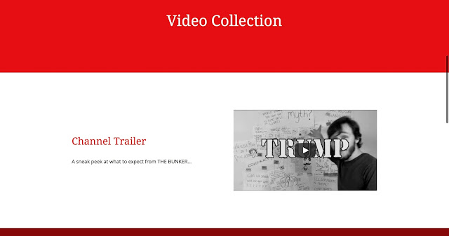
Firstly, we had to decide on the colour scheme. We decided we wanted something bright and bold in order to appeal to our target audience of young adults. For this, we decided to go for red. We also use red in our news production for some of the labels under the titles - this helps to tie the production and the website together.
For font, we decided to go for a simple font - again, this font is similar to the one used in our production - strengthening / adding to our brand.
We wanted to keep the website simple and not overload the audience with information - it just exists to back up our news show - not provide a load of new information. We also wanted to include a section where the audience can send in their own myths to be debunked - making our show interactive & further engaging our audience. We also created a twitter where the audience can also tweet in myths to be debunked or just keep updated with The Bunker.
This, however, wasn't how we had originally designed the website. Initially, we chose a slightly lighter colour scheme - however, the peachy colour seemed a little too feminine and may exclude our male audience. It also didn't fit with our channel brand - it wasn't bold and eye catching like we wanted it to be. We also hadn't added in our latest video yet - this is now on the new website.
Here's the original version:
Here's a link to our website: https://melmoore96.wixsite.com/thebunkermyths
Here's the twitter:


No comments:
Post a Comment