
The popular newsrooms, like the ones used on BBC and ITV use bright, primary colours. These colours are bright and enticing and don't exclude anyone as their audience (i.e. a pink background may exclude male viewers).
For our production we want to use bright colours with red looking like a strong contender. We will insert this in the edits - maybe through the titles and somehow in the background of the studio shot. Whatever colour we choose, we will carry over on the website as well to tie our news production and website together (which will help to establish our brand).
The newsrooms use the same colour in their studio, for their logo and on their website. This shows the importance of using colour to tie together your brand and strengthen your image.


Colour is a very important aspect - different colours can suggest different things about the brand image.
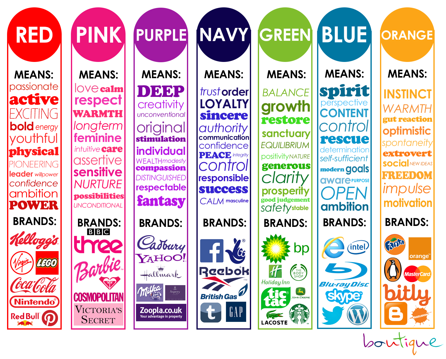
We are leaning towards red as our main colour as it connotes many of our brand values - we want our brand to be bold, exciting and youthful - red suggests all of these qualities.
No comments:
Post a Comment